Skip to content
PSSSF01 / Introduction

Cover, Foreword (pp. 1–4)

01 Introduction

Brand Guidelines

PSSSF logo in white

Leo. Kesho. Pamoja.

The official brand guidelines of the Public Service Social Security Fund (PSSSF), Tanzania — published online as the central reference for applying the PSSSF identity.

Organisation
Public Service Social Security Fund
Document
Brand Guidelines
Year
2026
Version
1.4

Foreword

Welcome to the Public Service Social Security Fund (PSSSF) Brand Guidelines.

As one of the largest and most trusted social security institutions in the country, PSSSF has a profound responsibility to serve our members with the highest standards of excellence, transparency, and integrity. Our brand is not merely a logo or a set of colors; it is a reflection of our mission, our values, and the trust we have built over time with the public.

The guidelines that follow provide detailed directives on our logo usage, typography, color palette, and more, ensuring that every representation of PSSSF—whether through our digital presence, printed materials, or project site signage—speaks with a coherent and powerful voice. By adhering to these guidelines, you help us maintain the strength and clarity of our brand identity.

We thank you for your commitment to upholding the quality and coherence that PSSSF is known for, as to build a future where social security stands as a pillar of national progress and individual dignity

Sincerely,
Abdul-Razaq Badru, Director General
Public Service Social Security Fund (PSSSF)

How to Use

This website reproduces the PSSSF Brand Guidelines (2026, Version 1.4) as a searchable, linkable reference. Each numbered chapter follows the structure of the printed manual: strategy, tone of voice, logo, monogram, typography, color, photography, brand elements and grids, applications and documentation.

Use the numbered menu on the left (or the Contents button on mobile) to jump to any rule. Every heading has its own link, so you can share a direct address to a specific guideline. Color codes can be copied with one click, and every logo, image and file can be downloaded.

Figures marked “Manual p.” are reproduced directly from the official PDF. Before designing or publishing anything, check the relevant chapter to make sure every brand element is used correctly and consistently.

Downloads

PSSSF Brand Guidelines (full manual)

PDF, 120 pages · 7.9 MB — The authoritative source document for every rule on this site.

Download

Logo, typography and other asset files are listed in 11 Documentation — Downloadable Assets.

What’s New in Version 1.4

  • All wording reviewed and aligned with PSSSF’s mission, members and services.
  • Target Audience rewritten for PSSSF members, pensioners and employers.
  • New Color Usage and Color Misuse guidance, Glossary, FAQs and Additional Resources.
  • Colour values unified to the detailed specifications; monogram minimum sizes confirmed (print 12 mm, digital 45 px).
  • Vector (SVG) logo files and a complete downloadable Logo Pack.
  • Every figure available as a high-resolution download.

Strategic Foundation 1.1–1.8 (pp. 5–16)

02 Strategic Foundation

1.1

Our Vision

Our vision is to be an outstanding provider of social security services in Tanzania; setting the benchmark for excellence in delivering accessible, efficient, and sustainable social protection programs that improve the quality of life for all Tanzanians.

We aim to lead by example, fostering trust and ensuring equitable support for individuals and communities, while continuously innovating to meet the evolving needs of our society.

1.2

Our Mission

Our mission is to provide high-quality social security services through competent, motivated staff and appropriate technology.

We foster continuous learning to keep our team at the forefront of best practices while implementing innovative solutions to enhance efficiency, accuracy, and accessibility. We aim to streamline processes, improve customer experiences, and adapt to evolving needs.

1.3

Core Values

Customer Focus
We are committed to understanding and prioritizing the needs and satisfaction of our customers to deliver exceptional service and build lasting relationships.
Integrity
We uphold honesty and strong ethical principles in all our actions and decisions, fostering trust and respect among colleagues and clients.
Team Work
We promote effective collaboration with colleagues across all levels to achieve common goals, enhance productivity, and create a supportive work environment.
Professionalism
We demonstrate competence, respect, and dedication in all our interactions and tasks, ensuring high standards of quality and accountability in our work.
Transparency
We ensure open communication and clarity in processes, decisions, and operations, allowing stakeholders to have insight into our actions and intentions.
Compliance
We adhere to laws, regulations, and organizational policies to maintain accountability.

1.4

Our Story

The Public Service Social Security Fund (PSSSF) was founded in 2018 through the merger of four major pension funds in Tanzania. These were the Government Employees Provident Fund (GEPF), the Local Authorities Pension Fund (LAPF), the Parastatal Pensions Fund (PPF) and the Public Service Pension Fund (PSPF). This unification aimed to streamline the administration of pension benefits, improve efficiency, and ensure better management of resources. By bringing these funds together, the government sought to create a more reliable and sustainable social security system that better served the needs of public servants.

PSSSF was created to ensure that all public servants, from local authorities to parastatal employees, received fair and equitable retirement, disability, and survivor benefits. The fund’s formation marked a significant step toward providing consistent and long-term financial security for public service workers across Tanzania.

GEPF

Government Employees Provident Fund

LAPF

Local Authorities Pension Fund

PPF

Parastatal Pensions Fund

PSPF

Public Service Pension Fund

Merged in 2018 to form PSSSF.

1.5

Purpose

The purpose of the Public Service Social Security Fund (PSSSF) is to provide comprehensive social security for public servants in Tanzania. This includes ensuring adequate retirement benefits, offering financial support for disability, and providing survivor benefits to dependents in the event of a member’s death. Additionally, PSSSF promotes the overall welfare of its members by facilitating access to social services while effectively managing contributions to ensure the sustainability of benefits for current and future beneficiaries. Through these efforts, PSSSF aims to enhance the quality of life and security for public servants and their families.

1.6

Brand Overview

The Public Service Social Security Fund (PSSSF) is Tanzania’s premier social security institution, dedicated to serving public servants with integrity and dependability. PSSSF ensures the financial security and welfare of its members through comprehensive pension schemes and benefits. Our commitment is rooted in transparency, accountability, and service excellence. We strive to foster trust and confidence among our stakeholders, continually adapting to the evolving needs of our members. PSSSF champions progressive and sustainable practices, reinforcing our role as a pillar of stability for the public sector workforce in Tanzania.

Our brand embodies trust, commitment, and community-focused service.

1.7

Target Audience

Customers
PSSSF serves public service employees across Tanzania — active contributing members, pensioners and their dependants — together with employers in the public sector, government institutions and partners. They look for secure pensions, timely benefits and reliable service.
Interests
They are interested in retirement planning, financial security, benefit entitlements and convenient digital services, and they value staying informed about their contributions and the Fund’s performance.
Behavior
Members value transparency, prompt responses and easy access to services, whether through Member Service Centres, the mobile app or online portals. Employers rely on clear guidance on contributions and compliance.
Key Demographics
The primary audience includes public servants aged 18–60 and retirees aged 55 and above, located in both urban and rural areas across all regions of Tanzania.
Content Preferences
They prefer clear, practical content in Kiswahili and English — guides, statements, FAQs, SMS and social media updates — that explains benefits and services simply.

1.8

Customer Personas

Customer Persona – 01

Portrait used for persona John Mwenda
Manual p. 13 Download high-res

Civil Engineer

Name
John Mwenda
Age
38
Gender
Male
Member type
Contributing member
Occupation
Civil Engineer (Government Employee)
Location
Dar es Salaam, Tanzania
Education
Bachelor’s Degree in Civil Engineering
Family
Married with two children
Background

John Mwenda is a mid-career public servant working as a civil engineer for a government department. He has been employed in the public sector for 12 years and is highly committed to his role, ensuring that public infrastructure projects meet the country’s needs. John is focused on his long-term career growth and stability, as well as securing his financial future for himself and his family.

Goals
  1. Ensure his contributions to PSSSF will secure a stable pension upon retirement.
  2. Stay informed about the services and benefits available through PSSSF.
  3. Access user-friendly tools to track his contributions and benefits.
  4. Ensure his family will be protected in case of any unforeseen events.
Challenges
  1. Balancing work and personal life, leaving little time to focus on financial planning.
  2. Uncertainty about how much he will receive from his pension after retirement.
  3. Difficulty navigating some government systems and processes.
Needs from PSSSF
  1. Transparent and up-to-date communication about his contributions and expected benefits.
  2. Financial education programs that explain retirement planning and other benefits.
  3. Assurance that PSSSF’s services are reliable and easily accessible.
Content Preferences
  1. Financial Planning Tips
  2. Contribution Updates and Pension Projections
  3. Educational Webinars/Workshops
  4. Government and Policy Updates

Customer Persona – 02

Portrait used for persona Aisha Mohamed
Manual p. 14 Download high-res

Secondary School Teacher

Name
Aisha Mohamed
Age
28
Gender
Female
Member type
Contributing member
Occupation
Secondary School Teacher
Location
Dodoma, Tanzania
Education
Bachelor’s Degree in Education
Family
Single, no children
Background

Tech-savvy and ambitious, eager to grow in her career.

Goals
  1. Saving for a down payment on a house.
  2. Planning for her future financial security.
  3. Pursuing further education.
Challenges
  1. Balancing saving with daily expenses.
  2. Understanding the complexities of PSSSF benefits and investment options.
Needs from PSSSF
  1. Clear and concise information about her contributions and benefits, accessible online resources (website, mobile app), financial literacy programs, and guidance on long-term savings strategies.
Content Preferences
  1. Short videos
  2. Social media updates
  3. Mobile app notifications
  4. Infographics

Customer Persona – 03

Portrait used for persona John Msuya
Manual p. 15 Download high-res

Public Servant

Name
John Msuya
Age
45
Gender
Male
Member type
Contributing member
Occupation
Government Administrator
Location
Mwanza, Tanzania
Education
Master’s degree in Public Administration
Family
Married with three children
Background

Holds a Master’s degree in Public Administration from Mzumbe University. Has been contributing to PSSSF for over 15 years. Looking for ways to maximize his retirement benefits.

Goals
  1. Secure a comfortable retirement, support his children’s education, potentially access a mortgage through PSSSF.
Challenges
  1. Keeping track of his contributions and benefits, understanding the different retirement options available, planning for healthcare costs in retirement.
Needs from PSSSF
  1. Personalized statements and projections
  2. Retirement planning advice
  3. Information about mortgage options and other loan facilities
  4. Access to customer service representatives for complex inquiries.
Content Preferences
  1. Detailed guides and brochures
  2. Online portals with personalized information
  3. Email newsletters
  4. In-person seminars and workshops

Customer Persona – 04

Portrait used for persona Fatuma Hassan
Manual p. 16 Download high-res

Retired Teacher

Name
Fatuma Hassan
Age
65
Gender
Female
Member type
Retiree
Occupation
Retired Primary School Teacher
Location
Arusha, Tanzania
Education
Diploma in Education
Family
Widow with three adult children
Background

Fatuma Hassan dedicated 35 years of her life to teaching at various public schools. She retired five years ago and now spends most of her time with her grandchildren and attending community events. Having contributed to PSSSF throughout her career, she now relies on her pension for her financial stability and to support her day-to-day expenses.

Goals
  1. Ensure her pension is disbursed on time and consistently.
  2. Remain financially independent and maintain her quality of life during retirement.
  3. Access PSSSF services without the need to frequently travel to service centers.
  4. Feel secure knowing that PSSSF will provide lifelong support.
Challenges
  1. Limited mobility and access to physical offices, preferring online or phone services.
  2. Difficulty in understanding complex pension policies or changes to the system.
  3. Concerns about rising living costs and how her pension will keep up.
Needs from PSSSF
  1. Timely and consistent pension disbursements.
  2. Clear communication about any policy updates or benefit changes.
  3. Easy access to customer service, whether by phone or online, for any assistance.
  4. Information on additional benefits or services she may be eligible for as a retiree.
Content Preferences
  1. Newsletters
  2. Guides and Articles
  3. Video Content
  4. Community Stories

Tone of Voice 1.1–1.5 (pp. 17–22)

03 Tone of Voice

1.1

Overview

The tone of voice for PSSSF is formal, professional, and authoritative, yet approachable. It conveys trust, transparency, and reliability, emphasizing the Fund’s commitment to safeguarding public service employees’ futures through secure pensions, social benefits, and financial stability, while fostering long-term partnerships with its members.

This guide helps all representatives of PSSSF maintain a consistent and engaging voice, whether in marketing materials, client meetings, or presentations, ensuring our brand’s message is coherent and impactful.

1.2

Characteristics

The tone of voice for PSSSF is a cornerstone of our brand identity, encapsulating professionalism, clarity, confidence, and consistency. Each communication is crafted to reflect our expertise in social security, pensions and member services with an authoritative yet accessible approach. Whether engaging with clients or the public, our language is always inclusive, inspiring, and precisely aligned with our core values. This consistency ensures that our brand resonates with reliability and innovation in every message.

YouthfulMature
FeminineMasculine
SimpleComplex
TraditionalContemporary
FriendlyAuthoritative
PlayfulSerious
RebelConventional
IndustrialNatural
Mass appealElite
EconomicalExpensive
CasualElegant
InnovativeClassic

Slider positions read from the diagram on manual p. 19.

1.3

Writing Style and Tone

PSSSF employs a writing style that is engaging and informed, mirroring the care with which we manage our members’ benefits. Our tone is consistently professional yet approachable, ensuring that our messages resonate with a wide audience while maintaining the integrity of our expertise. Clear, concise, and compelling, our language aims to educate and inspire, seamlessly blending technical accuracy with accessible communication. This approach strengthens our narrative, making our pension and social security services both understandable and appealing.

Professional

Ensures all communications reflect expertise and commitment to quality in social security and pension services.

Clear

Communicates in an easily understandable way, minimizing jargon and clarifying necessary technical terms.

Confident

Projects confidence in our capabilities, showcasing leadership in secure, member-focused social security services.

Consistent

Maintains uniformity across all communications to strengthen brand recognition and trust.

1.4

Messaging Guidelines

At PSSSF, every message reinforces our commitment to innovation and sustainability in social security services. Our messaging guidelines are designed to ensure that all communications are aligned with our brand values and effectively engage our target audience.

Consistency
Keep the core message consistent across all platforms to build brand recognition. Whether in print, online, or in-person, the fundamental message of security, trust and service to our members remains steadfast.
Engagement
Aim to engage the audience by relating content to their interests and needs. Use compelling member stories and examples that illustrate the impact of our pensions and benefits.
Clarity and Precision
Be clear and precise in all communications. Avoid ambiguity and ensure that every message is easy to understand and direct.
Call to Action
Include a clear call to action in appropriate communications, guiding the audience on the next steps, whether it’s registering as a member, checking contributions, claiming benefits or contacting us for support.

1.5

Brand Language and Terminology

The language we use reflects the precision and care of our social security services. At PSSSF, we employ a vocabulary that not only defines our expertise but also makes our services accessible and relatable to our diverse members and stakeholders.

Tone
PSSSF’s tone of voice is formal, clear, and trustworthy, maintaining a professional demeanor while remaining approachable and inclusive. It conveys a sense of responsibility, integrity, and reliability in every communication, emphasizing the Fund’s commitment to safeguarding the future of public service employees.
Consistency
Every piece of communication from PSSSF maintains consistency in terminology and style, ensuring that all stakeholders understand and trust the Fund’s mission and services.
Clarity and Simplicity
Language used should be easy to understand, avoiding unnecessary jargon. Whether addressing members, stakeholders, or the general public, the focus is on delivering information in a straightforward and transparent manner.
Empathy and Support
Communications are empathetic and supportive, recognizing the importance of social security in people’s lives. The language expresses care and respect for members, ensuring they feel valued and reassured.
Official tagline

Leo. Kesho. Pamoja.
Visual Identity 2.1–2.5 (pp. 33–38)

05 Monogram

2.1

Monogram

The PSSSF monogram, featuring the eagle, serves as a compact representation of our commitment to security, trust, and empowerment. Utilizing key elements from our primary logo, this monogram is crafted to stand alone in contexts where simplicity and instant recognition are essential, such as digital platforms or small merchandise.

PSSSF eagle monogram

2.2

Monogram Anatomy

This section provides an in-depth look at the structural grid within which our monogram is designed. By breaking down the alignment, proportions, and geometric balance, we ensure that the monogram is reproduced consistently, retaining its visual impact and brand integrity regardless of scale or application.

Monogram on its construction grid
Manual p. 35 Download high-res

2.3

Monogram Clearspace & Minimum Size

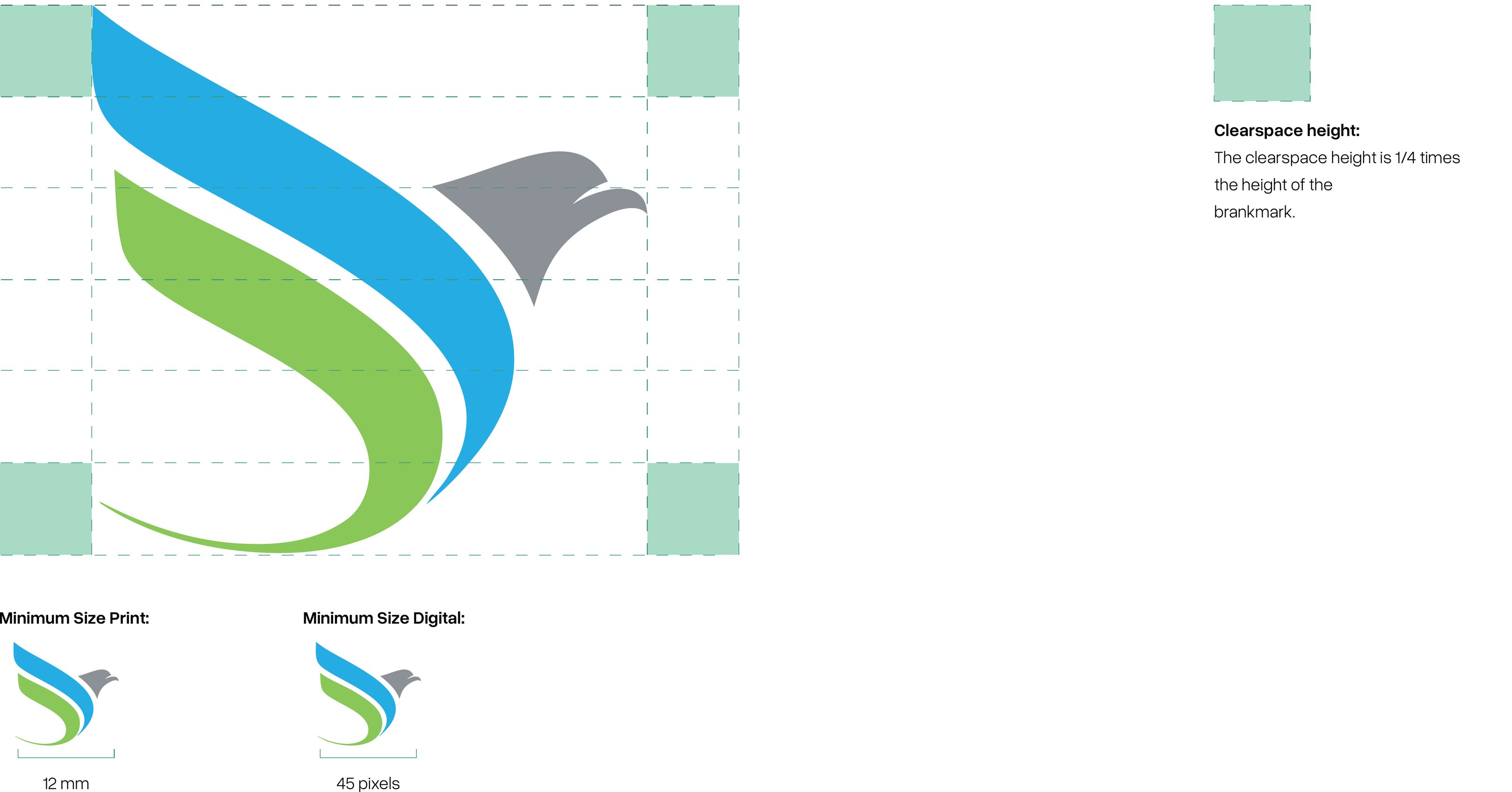
Maintaining clearspace around the monogram is critical to ensure its visibility and effectiveness. For print use, a minimum size of 12mm ensures clarity, while in digital, a minimum of 45 pixels is required to preserve the monogram’s integrity. This section outlines these specifications to guide proper scaling and spacing.

Monogram clearspace and minimum size diagram
Manual p. 36 Download high-res
ClearspaceThe clearspace height is 1/4 times the height of the brandmark.
Minimum size — print12 mm
Minimum size — digital45 pixels

2.4

Monogram Usage

The monogram is utilized in various brand materials where space is limited or a simplified identity is more effective. Its applications range from corporate stationery and business cards to digital platforms like mobile apps and online profiles. This versatility makes it an essential tool in our branding arsenal, providing a consistent yet flexible identity marker.

Approved monogram colour combinations
Manual p. 37 Download high-res

2.5

Monogram Misuse

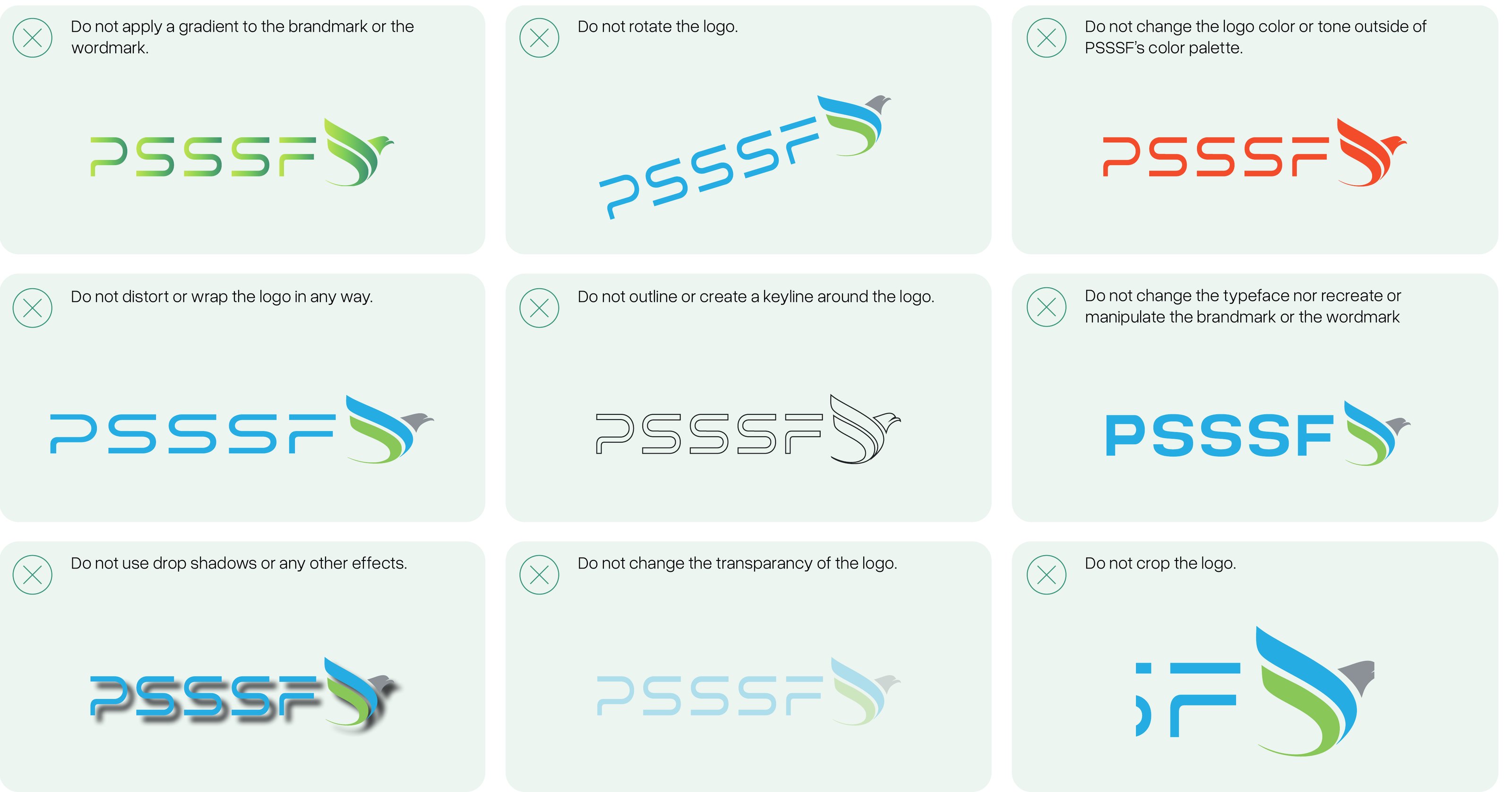
To avoid diluting our brand’s strength, it’s crucial to adhere to the guidelines outlined for monogram usage. Misuse examples include altering the monogram’s color scheme to nonbrand colors, distorting its shape in any form, or applying it in inappropriate contexts that could diminish its professional appearance. This page details such misuses to prevent common errors in brand application.

Nine examples of incorrect monogram use
Manual p. 38 Download high-res
  • Do not apply a gradient to the brandmark.
  • Do not rotate the brandmark.
  • Do not change the brandmark color or tone outside of the color palette.
  • Do not distort or wrap the brandmark in any way.
  • Do not outline or create a keyline around the brandmark.
  • Do not overlap or place elements too close to the brandmark.
  • Do not use drop shadows or any other effects.
  • Do not change the transparency of the brandmark.
  • Do not crop the brandmark.

Visual Identity 3.1–3.5 (pp. 39–44)

06 Typography

3.1

Primary Typeface

Our primary typeface, chosen for its modern and clean lines, enhances readability and offers a professional aesthetic that aligns with PSSSF’s brand identity. It is used predominantly in all major headings and body text to maintain a consistent and cohesive appearance across all communications, reinforcing our values of trust and clarity.

Overused Grotesk

Overused Grotesk – Light

Aa

ABCDEFGHIJKLMNOPQRSTUVWXYZ abcdefghijklmnopqrstuvwxyz 0123456789 !@#$%^&*

Overused Grotesk – Regular

Aa

ABCDEFGHIJKLMNOPQRSTUVWXYZ abcdefghijklmnopqrstuvwxyz 0123456789 !@#$%^&*

Overused Grotesk – Semibold

Aa

ABCDEFGHIJKLMNOPQRSTUVWXYZ abcdefghijklmnopqrstuvwxyz 0123456789 !@#$%^&*

Overused Grotesk – Bold

Aa

ABCDEFGHIJKLMNOPQRSTUVWXYZ abcdefghijklmnopqrstuvwxyz 0123456789 !@#$%^&*

Rendered with the Overused Grotesk font files supplied by PSSSF.

3.2

Replacement Typeface

Roboto serves as our replacement typeface. It’s selected for its versatility and clarity, ensuring that when Overused Grotesk is not available, our communications still maintain visual integrity and coherence in all digital and print formats.

Roboto

Roboto – Light

Aa

ABCDEFGHIJKLMNOPQRSTUVWXYZ abcdefghijklmnopqrstuvwxyz 0123456789 !@#$%^&*

Roboto – Regular

Aa

ABCDEFGHIJKLMNOPQRSTUVWXYZ abcdefghijklmnopqrstuvwxyz 0123456789 !@#$%^&*

Roboto – Medium

Aa

ABCDEFGHIJKLMNOPQRSTUVWXYZ abcdefghijklmnopqrstuvwxyz 0123456789 !@#$%^&*

Roboto – Bold

Aa

ABCDEFGHIJKLMNOPQRSTUVWXYZ abcdefghijklmnopqrstuvwxyz 0123456789 !@#$%^&*

Rendered with Roboto from Google Fonts.

3.3

Typography Hierarchy

Our typography hierarchy is structured to guide readers through our content seamlessly. It includes specifications for Header 1, 2, 3, Body Copy, and Call to Action, ensuring that each text level is distinct and effective in communicating our message with the intended emphasis and clarity.

Clarity Through Clean Design

Secure and Member-Centric

Structuring Communication with Precision

For our members, every detail matters; the same is true for our typography. At PSSSF, our typography hierarchy is meticulously designed to guide readers clearly and efficiently, ensuring our messages about pensions, benefits and social security are delivered with precision.

LEARN MORE ABOUT OUR STYLE

Specimen scaled proportionally for screen.

LevelTypefaceSizeLeadingTracking / Kerning
Header 1Overused Grotesk – Light140pt/140pt140pt0 / 0
Header 2Overused Grotesk – Light55pt60pt0 / 0
Header 3Overused Grotesk – SemiBold34pt39pt0 / 0
Body CopyOverused Grotesk – Light21pt31pt0 / 0
Call-To-ActionOverused Grotesk – SemiBold21pt31pt0 / 0

3.4

Application

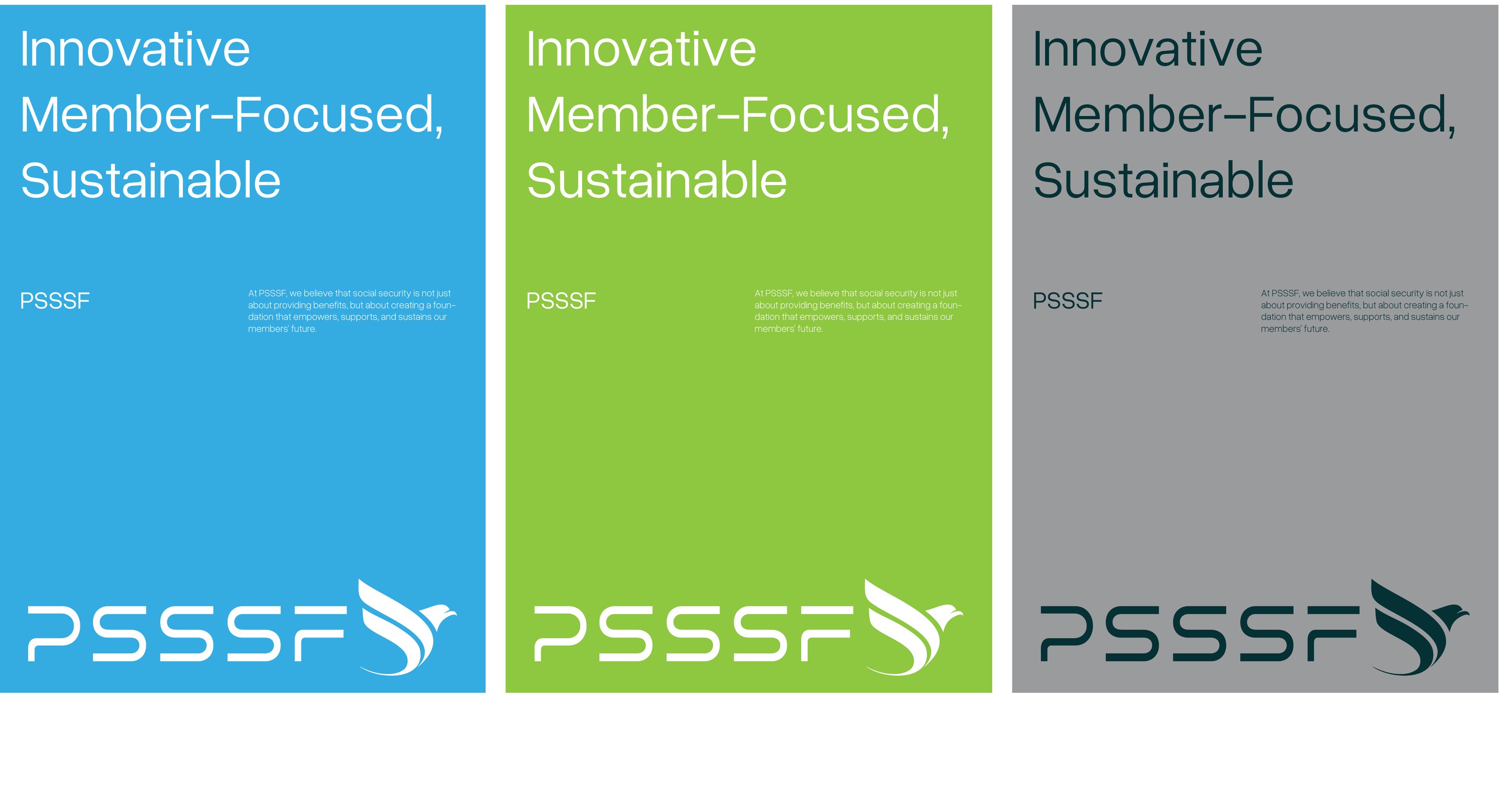
This page demonstrates the application of our typography in real-world scenarios, illustrating how Overused Grotesk and Roboto are used across various media. Examples include website interfaces, marketing materials, and official documentation, showcasing the adaptability and impact of our typographic choices.

Typography applied on blue, green and grey panels with the logo
Manual p. 43 Download high-res

3.5

Typography Misuse

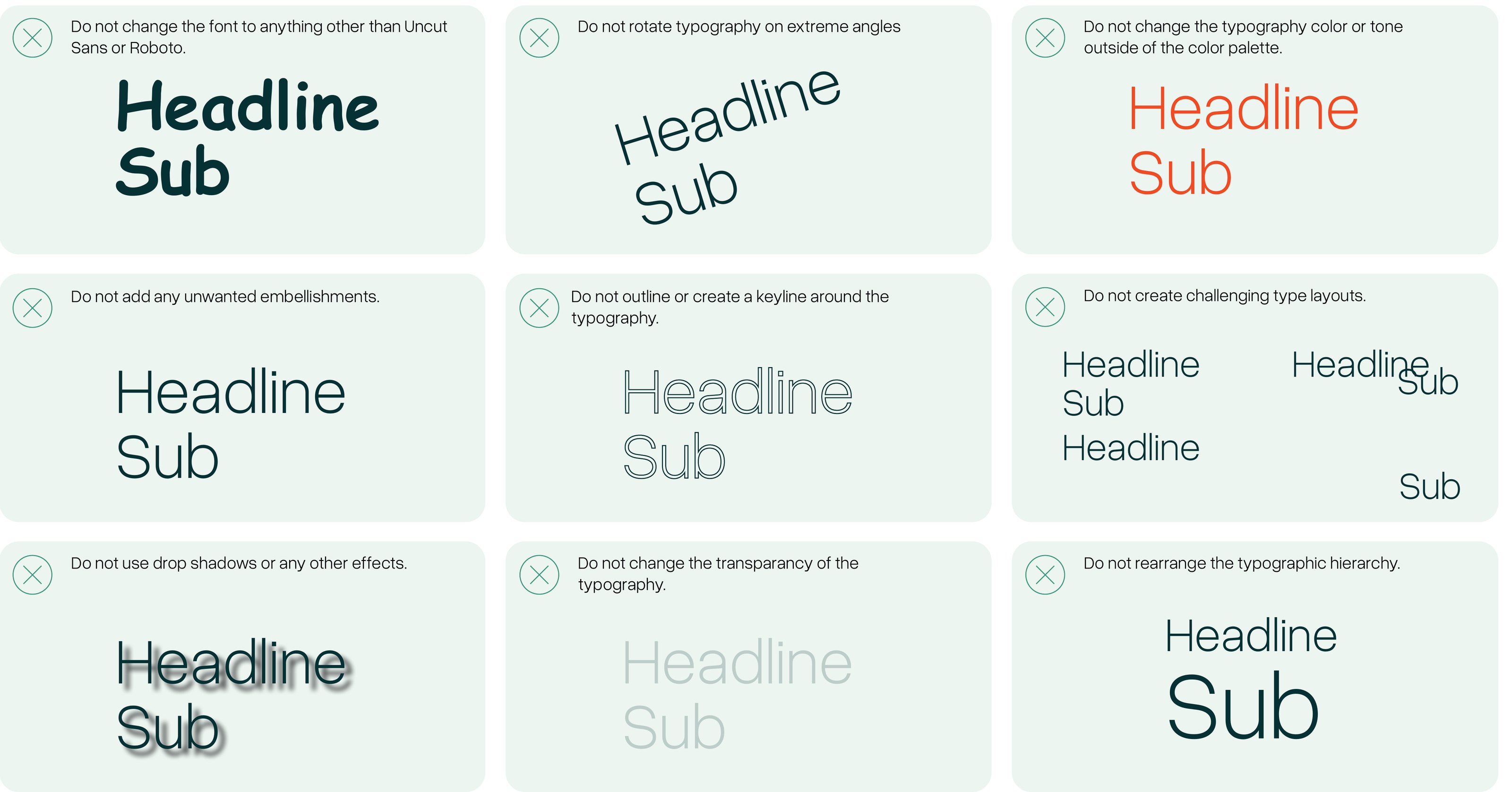
Proper use of typography is crucial for maintaining our brand’s professionalism. This section highlights nine common misuses, such as improper kerning, using incorrect typefaces for specific text types, or misalignment of headers and body text, providing clear examples to avoid these pitfalls.

Nine examples of incorrect typography use
Manual p. 44 Download high-res
  • Do not change the font to anything other than Overused Grotesk or Roboto.
  • Do not rotate typography on extreme angles
  • Do not change the typography color or tone outside of the color palette.
  • Do not add any unwanted embellishments.
  • Do not outline or create a keyline around the typography.
  • Do not create challenging type layouts.
  • Do not use drop shadows or any other effects.
  • Do not change the transparency of the typography.
  • Do not rearrange the typographic hierarchy.

Visual Identity 4.1–4.6 (pp. 45–49)

07 Color

4.1

Proportion

Our brand identity employs a palette designed to reflect trust and strength, featuring confident blues, fresh greens and neutral greys. The primary palette uses these colors Butterfly Blue, Pea Green, and Star Dust predominantly, ensuring a cohesive and professional appearance. Secondary colors like Firefly, Lightning Yellow, and White are used to accent and highlight, balancing the overall visual impact, with a clear emphasis on strength, sustainability, and simplicity to align with PSSSF values.

60% Butterfly Blue
30% Pea Green
10% Star Dust
Firefly
Lightning Yellow
White

4.2

Primary Colors

The primary colors of our brand are Butterfly Blue, Pea Green and Star Dust. These colors were chosen for their strong association with trust, growth and stability, embodying our commitment to securing the future of our members. They dominate our visual identity, ensuring consistency and immediate recognition across all branding materials.

Butterfly Blue

60%

HEX
RGB
CMYK

Pea Green

30%

HEX
RGB
CMYK

Star Dust

10%

HEX
RGB
CMYK

4.3

Secondary Colors and Tints

Our secondary colors include Firefly, Lightning Yellow and White. These are used to provide balance and complement the primary palette, adding depth and flexibility to our designs. They are ideal for backgrounds, typography, and less dominant design elements, enhancing the visual dynamics without overpowering the primary colors.

Firefly

HEX
RGB
CMYK

Lightning Yellow

HEX
RGB
CMYK

White

HEX
RGB
CMYK

Tint strips are sampled from the manual artwork; the manual does not specify tint values or percentages.

4.4–4.5

Color Usage & Misuse

Consistent use of colour is one of the quickest ways members recognise PSSSF. Butterfly Blue leads every communication, Pea Green supports it, and Star Dust adds a calm neutral balance. Secondary colours are used sparingly to highlight key information, guide action and keep layouts clear and accessible.

Color Usage

  • Use Butterfly Blue, Pea Green and Star Dust in a 60% / 30% / 10% proportion.
  • Use Firefly for body text and dark backgrounds to give strong, readable contrast.
  • Use Lightning Yellow only for highlights such as calls to action, key figures and alerts.
  • Use White generously as breathing space around text, photography and the logo.
  • Place the logo only on the approved backgrounds shown in Logo Usage (1.7).
  • Use CMYK values for print, and RGB or HEX values for screens.

Color Misuse

  • Do not introduce colours outside the PSSSF palette.
  • Do not let secondary colours dominate a layout over the primary palette.
  • Do not place white text on Lightning Yellow or White backgrounds.
  • Do not use gradients between brand colours.
  • Do not alter, tint or lighten brand colours beyond the approved tints.
  • Do not combine colours that reduce legibility or fail accessibility contrast.

4.6

Color Values Explanation

CMYK
CMYK stands for cyan, magenta, yellow, and key (black). This color model is primarily used in print media, and is based on the concept of subtractive color mixing. In this model, each color is represented as a percentage of the four colors - cyan, magenta, yellow, and black - that are combined to create the final color. For example, a deep red color might be created by combining 15% cyan, 100% magenta, 90% yellow, and 5% black. CMYK is a four-color model, which means that it can reproduce a wide range of colors, but not as many as RGB.
RGB
RGB stands for red, green, and blue. This color model is primarily used in digital media, and is based on the concept of additive color mixing. In this model, each color is represented as a value between 0 and 255 for red, green, and blue, which are combined to create the final color. For example, a bright green color might be created by combining 0% red, 100% green, and 0% blue. RGB is a three-color model, which means that it can reproduce a very wide range of colors, but not all the colors that CMYK can reproduce
HEX Color
Hex colors are commonly used in digital design, including website design, graphic design, and other digital media. They are a popular choice because they provide a standardized and consistent way of representing colors across different platforms and devices.
ColorHEXRGBCMYK
Butterfly Blue38, 169, 22483, 25, 0, 12
Pea Green139, 197, 6329, 0, 68, 23
Star Dust146, 147, 1503, 2, 0, 41
Firefly5, 51, 5190, 0, 0, 80
Lightning Yellow252, 187, 450, 26, 82, 1
White255, 255, 2550, 0, 0, 0

Visual Identity 5.1–5.3 (pp. 50–53)

08 Photography

5.1

Photography Overview

Our photography captures the essence of PSSSF’s mission, focusing on the trust, support, and empowerment we provide to our members. This section provides an overview of our approach to photography, highlighting key moments, member engagement, and community impact, all of which are central to conveying the dedication and security PSSSF stands for

Collage of PSSSF photography examples
Manual p. 51 Download high-res

5.2

Principles

Photography at PSSSF adheres to four core principles: Trust, People, Empowerment, and Clarity. These principles ensure our images authentically represent our members and services, embrace natural lighting, show genuine human interaction, and highlight our commitment to the wellbeing of public servants and their families.

Trust

Images should reflect PSSSF’s commitment to safeguarding the future of its members, capturing moments that evoke trust, reliability, and financial security.

People

The photography must emphasize people—members, staff, and communities—showing the positive impact of PSSSF’s services and the personal connections built over time.

Empowerment

Photographs should showcase PSSSF’s role in uplifting communities and empowering individuals, highlighting the collective progress and support offered by the organization.

Clarity

Visuals should be clear, professional, and straightforward, reflecting the transparent and dedicated nature of PSSSF’s operations while maintaining a consistent brand aesthetic.

5.3

Image Usage

Our photography is categorized into four main subjects to best represent our mission and values. ‘Member Interactions’ focuses on people and their engagement with PSSSF services; ‘Service Highlights’ emphasizes the key benefits provided; ‘Institutional Showcase’ captures PSSSF offices and operations in context; and ‘Community Impact’ highlights the positive effects of PSSSF on society. Each category is used strategically to tell a complete story of our commitment to security, trust, and empowerment.

Member Interactions
Service Highlights
Institutional Showcase
Community Impact
Grid of approved example photographs
Manual p. 53 Download high-res
Consistency
Ensure all images reflect PSSSF’s brand identity, using approved colors, styles, and themes that align with our core values—trust, security, and empowerment.
Relevance
Select images that directly relate to PSSSF’s services, community engagement, or member benefits, ensuring a clear connection between visuals and the message being conveyed.
Diversity
Use images that represent the diverse communities PSSSF serves, showcasing inclusivity and a broad range of members, staff, and stakeholders.
Quality
All images should be high-resolution, well-composed, and professional, reflecting the credibility and reliability of PSSSF.

Visual Identity 6.1–7.4 (pp. 54–68)

09 Brand Elements & Grid

6.1

Iconography

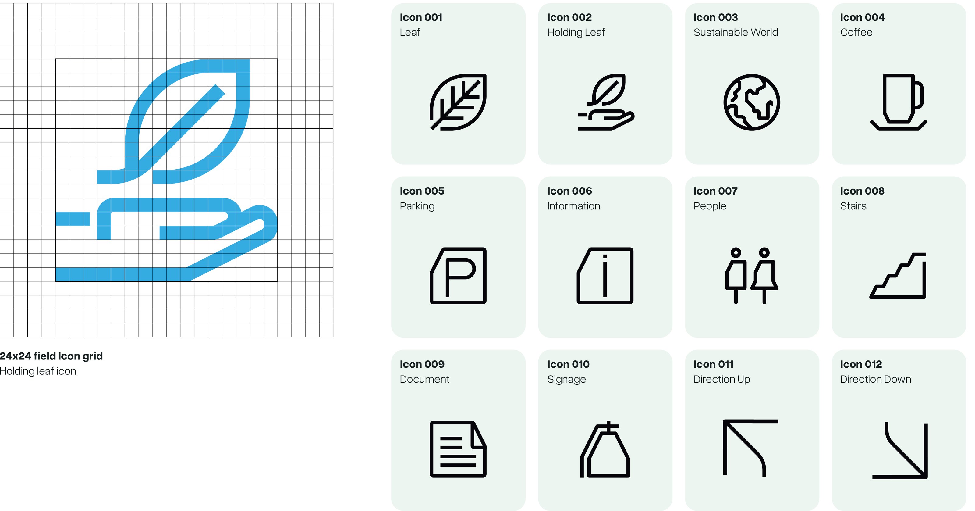
The PSSSF iconography is designed with simplicity, clarity, and consistency in mind, ensuring it effectively communicates our brand’s values of strength, security, and innovation. The icons feature clean lines and geometric shapes, maintaining a unified aesthetic across all platforms. They are scalable, ensuring legibility at any size, and are thoughtfully symbolic, representing key elements of our mission. Utilizing our primary and secondary color palettes, the icons maintain visual harmony and impact, whether in digital, print, or signage applications.

Icon grid (24x24 field) and the twelve PSSSF icons
Manual p. 55 Download high-res
Icon grid24×24 field (shown with the Holding leaf icon)
Icon set001 Leaf · 002 Holding Leaf · 003 Sustainable World · 004 Coffee · 005 Parking · 006 Information · 007 People · 008 Stairs · 009 Document · 010 Signage · 011 Direction Up · 012 Direction Down

6.2

Style Element

The key style element in our visual identity features geometric shapes—rectangles or squares—with a distinctive minus front cut at a 25-degree angle. Often integrated into layouts alongside photography, this style element serves as a visual anchor, adding depth and interest to our communications while maintaining a clean, modern aesthetic.

Blue geometric style element with 25-degree cuts
Manual p. 56 Download high-res

6.3

Patterns and Textures

Our patterns are crafted by repeating our brandmark, creating a seamless and striking visual tessellation that becomes a distinctive part of our brand’s identity. This repetitive use of the brandmark not only enhances brand recognition but also adds a textured visual interest to larger surfaces and backgrounds.

Repeating white brandmark pattern on Butterfly Blue
Manual p. 57 Download high-res

6.4

Illustration Style

Our illustration style uses clean, friendly line drawings in Butterfly Blue to represent the people we serve — public servants, retirees and their families. These illustrations are crafted to make pensions and social security feel approachable, effectively communicating our dedication to supporting members at every stage of life. The use of colours from our palette ensures that the illustrations are both lively and aligned with our brand’s core values, serving as a compelling tool for storytelling in our marketing and educational materials.

Three line illustrations of people in PSSSF blue
Manual p. 58 Download high-res

7.1

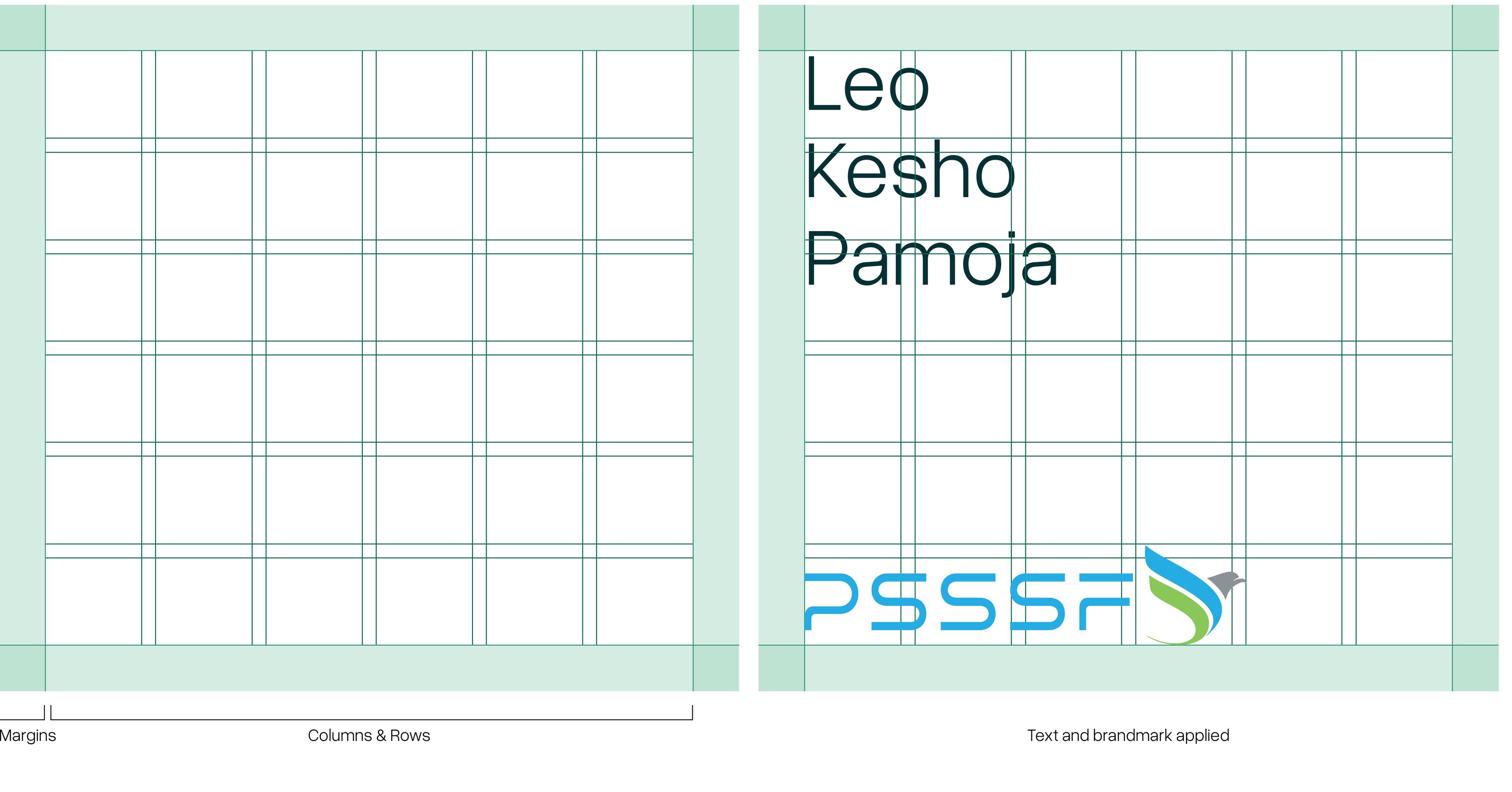
Margins and Columns

To ensure consistency across our digital and print mediums, all digital assets for PSSSF maintain a standard margin of 35 pixels, while print assets follow the margins specified for each format in Print Layouts (7.4). Our layouts are structured around even-numbered columns—4, 6, 8, 10, or 12—allowing for flexible yet balanced designs. This systematic approach ensures that all elements within the layout are harmoniously aligned and visually appealing, regardless of the content type or medium.

Margins, columns and rows, and text with brandmark applied
Manual p. 60 Download high-res
Digital margin35 px
Print marginAs specified per format (7.4) — 30 mm for A4, 15 mm for business cards
ColumnsEven numbers only — 4, 6, 8, 10 or 12

7.2

Types of Grid Systems

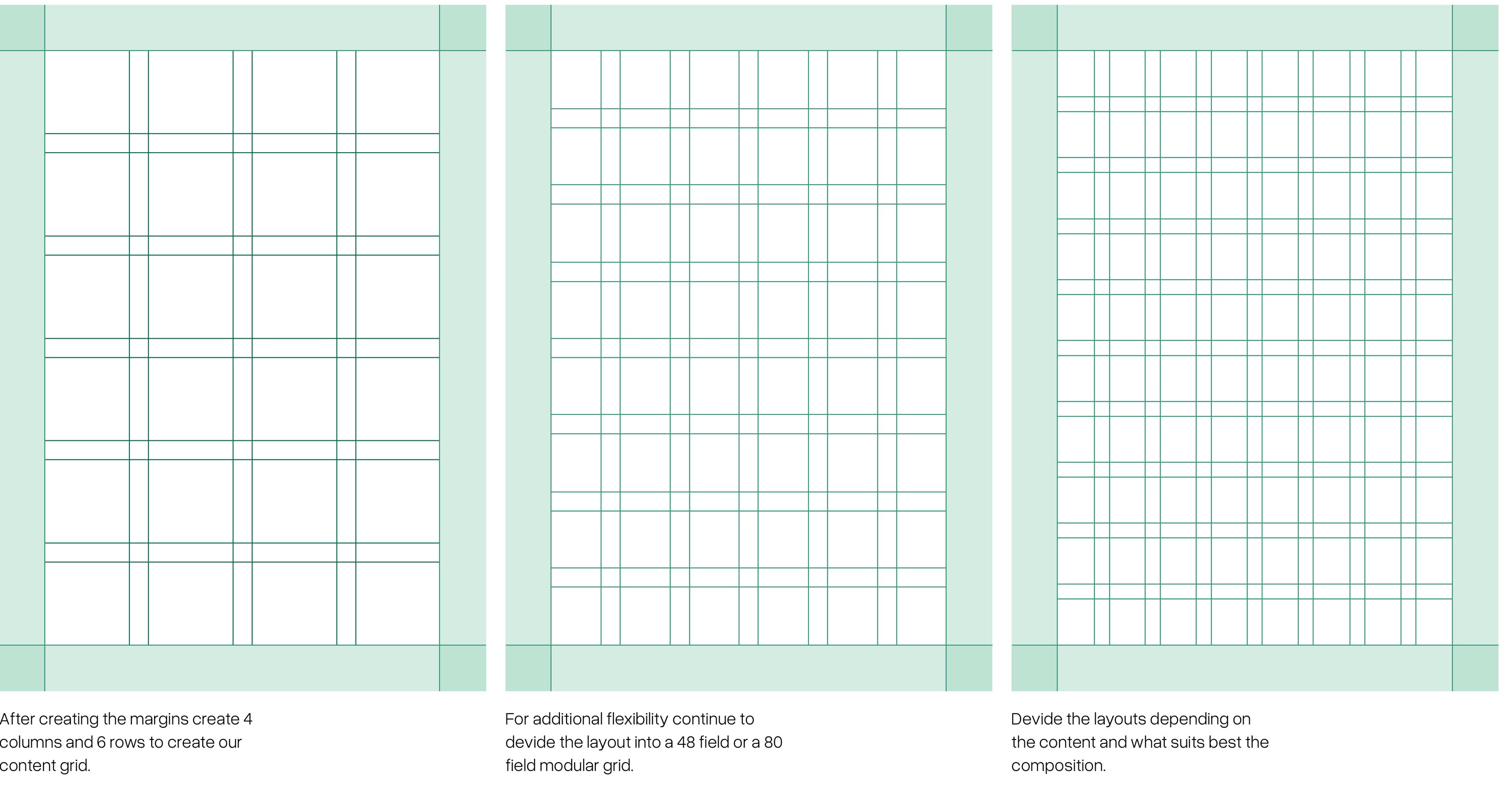
This section details three grid system examples meticulously designed to optimize the spatial distribution of text, images, and other graphic elements across diverse applications. These grids are foundational in creating designs that are visually coherent and structurally sound, supporting everything from complex web pages to streamlined print media. Each example is engineered so that rows and columns are always divisible by 2, providing a robust and adaptable framework.

  1. After creating the margins create 4 columns and 6 rows to create our content grid.
  2. For additional flexibility continue to devide the layout into a 48 field or a 80 field modular grid.
  3. Devide the layouts depending on the content and what suits best the composition.
Three steps of building the modular grid
Manual p. 61 Download high-res

Flexibility

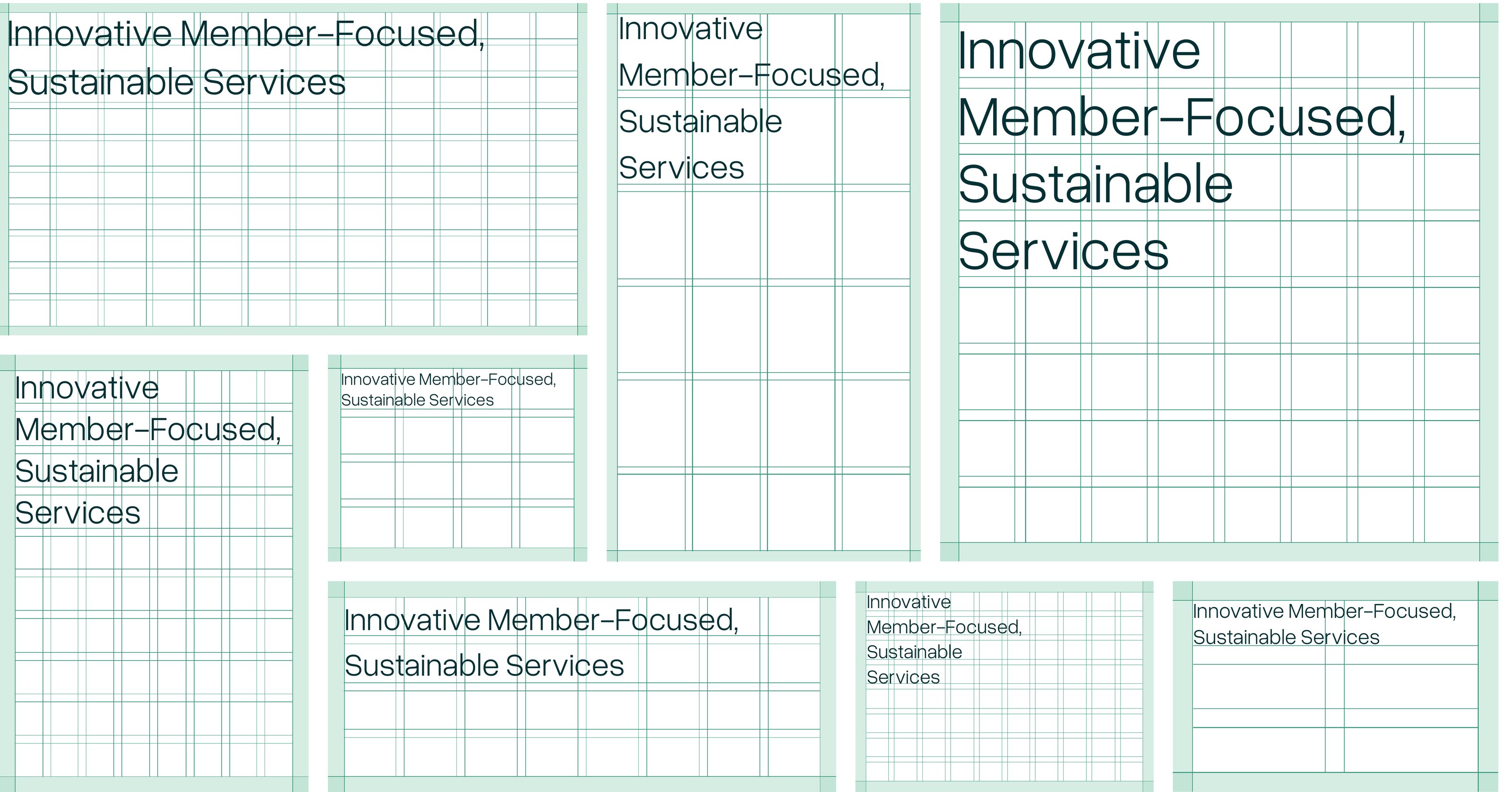
Highlighting the adaptability of our grid systems, this page features numerous configurations demonstrating how our design approach accommodates a wide range of creative demands. From annual reports to digital banners, the versatility of our grids ensures that designers have the freedom to innovate while maintaining a cohesive and engaging visual narrative. Each grid example shows potential applications and modifications, illustrating our commitment to dynamic yet consistent design solutions.

Grid configurations for different formats
Manual p. 62 Download high-res

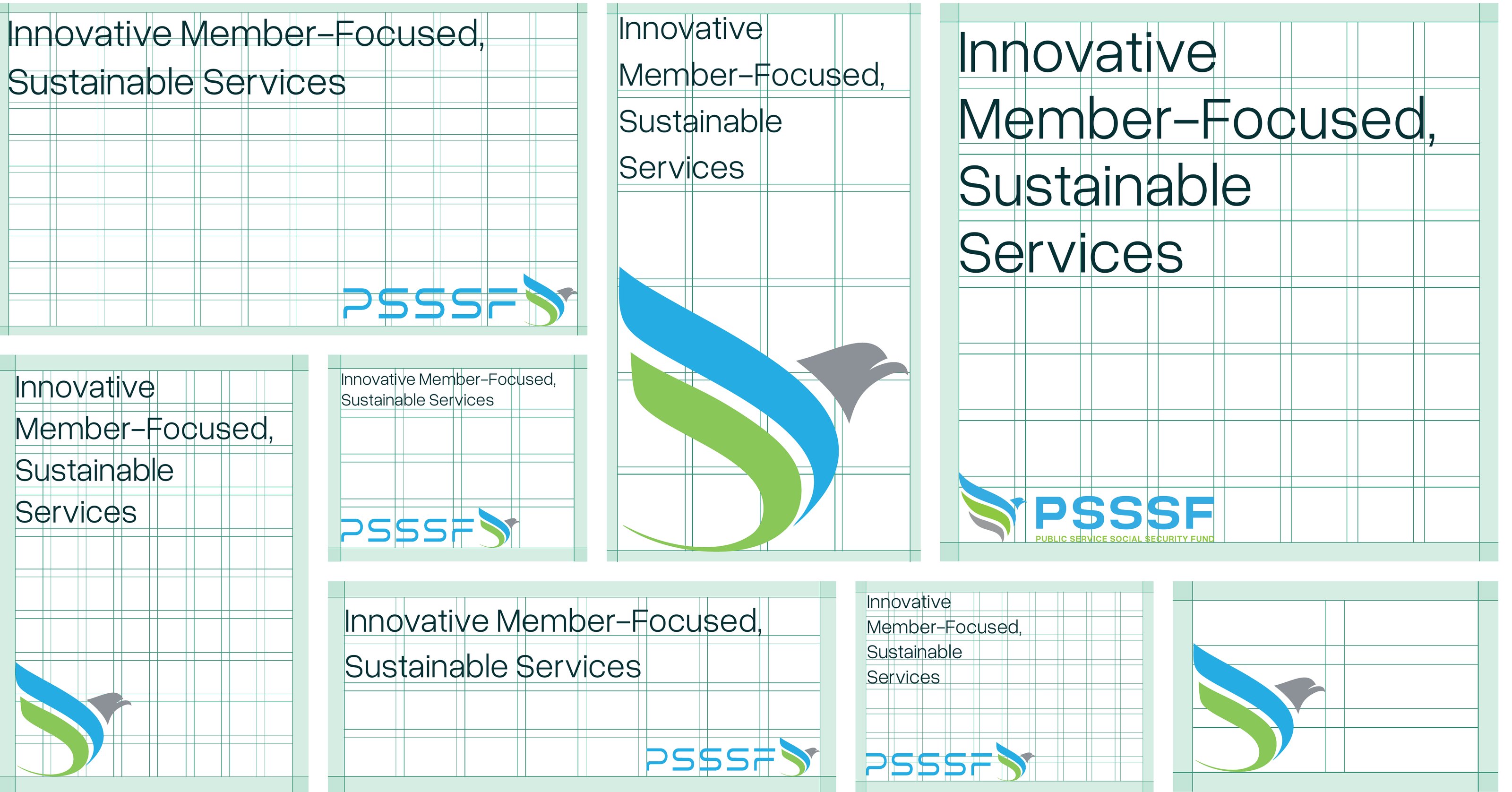
Applying Headlines

Effective headline placement is crucial for capturing attention and guiding readers through content. Positioned predominantly in the top left quadrant of the grid, headlines benefit from maximum visibility and priority. This section not only demonstrates optimal headline placement within various grid patterns but also shows how such placement enhances readability and viewer engagement, critical for marketing materials and editorial layouts.

Headline placement in the top-left of grid layouts
Manual p. 63 Download high-res

Applying Our Logo

Logo placement is a strategic decision that influences brand recognition and perception. Whether positioned in the lower left or right corners of our layouts, our logo is meticulously integrated to maintain visibility without overwhelming the design. This section illustrates effective logo placements within different grid contexts, ensuring that the logo’s presence enhances rather than disrupts the visual harmony of the layout.

Logo placement in lower corners of grid layouts
Manual p. 64 Download high-res

7.3

Layout Digital

Designed for maximum impact in digital environments, our standard digital layout adheres to a 1920x1080 resolution. The modular grid, detailed here, includes 12 columns and 10 rows with precise margins and gutters, offering flexibility and clarity in digital design. This layout is crucial for web interfaces and digital publications, where content must be both visually engaging and easy to navigate.

Horizontal digital layout grid
Manual p. 65 Download high-res

Layout Social Media

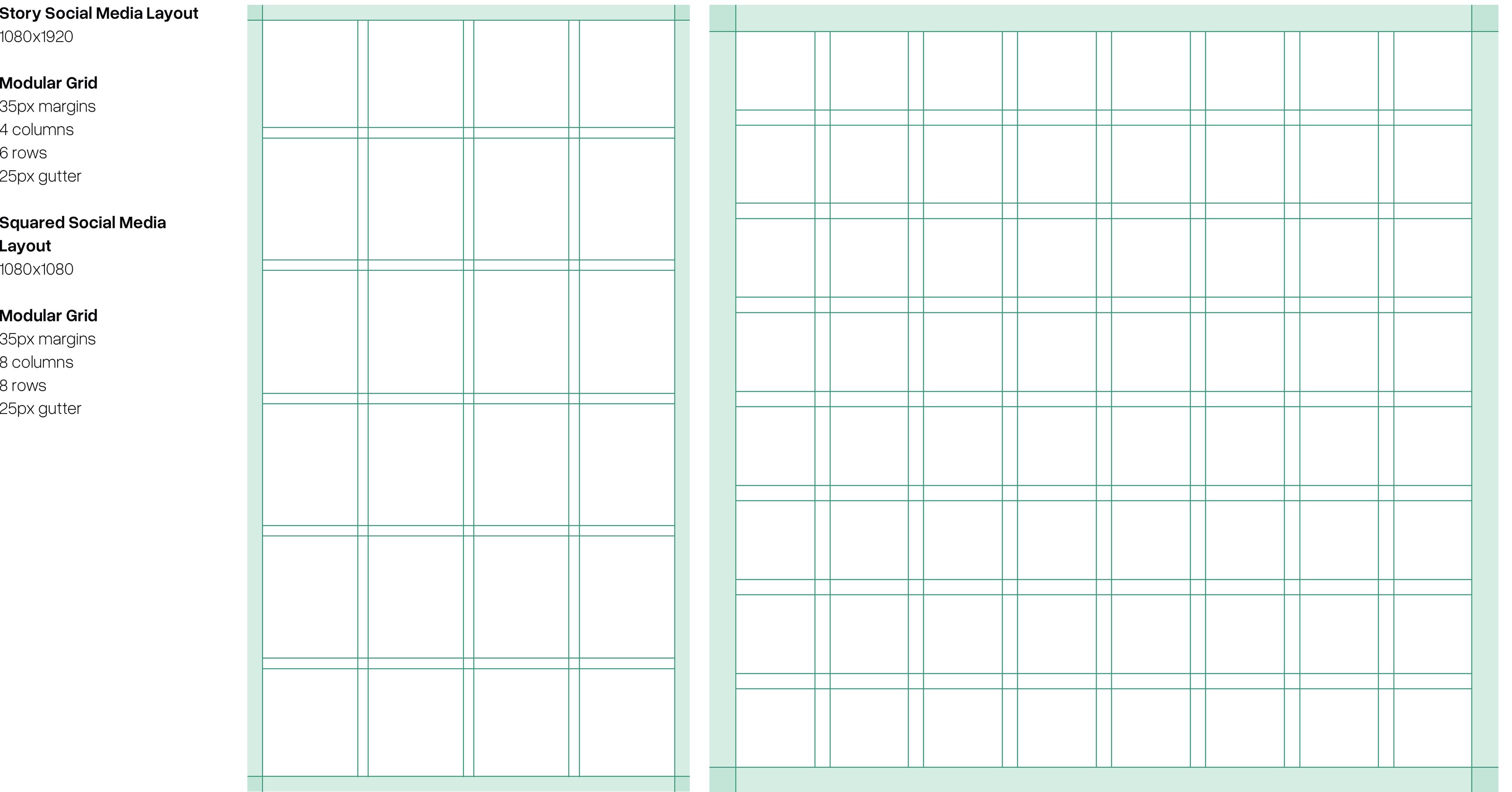
Optimized for social media engagement, our layouts ensure that visuals are compelling and maintain brand consistency across platforms. The specific dimensions and grid structures for stories, reels, and posts are tailored to enhance visual storytelling and user interaction on social media, reflecting best practices in digital marketing.

Story and square social media grids
Manual p. 66 Download high-res
LayoutSizeMarginsColumnsRowsGutter
Horizontal Digital1920×108035px121025px
Story Social Media1080×192035px4625px
Squared Social Media1080×108035px8825px

7.4

Layout Print

Our vertical print layouts are meticulously structured to accommodate detailed content in a clean and organized manner. The specified grid and margin settings are particularly effective for detailed reports, brochures, and promotional prints, where precision in text placement and graphic alignment are key to the document’s effectiveness.

Vertical print layout grid
Manual p. 67 Download high-res

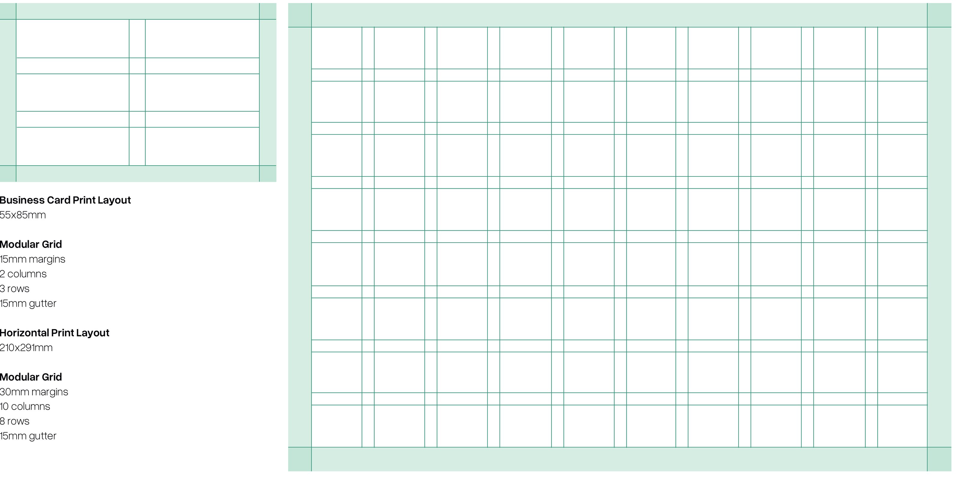
This section provides specific guidelines for horizontal print layouts, varying from business cards to large-scale prints. Each layout is tailored to the content’s nature and size, ensuring that every piece, whether it’s a compact business card or an expansive brochure, is designed to maximize both aesthetic appeal and functional clarity. Detailed descriptions of columns, rows, margins, and gutters are included to guide precise and effective print design.

Business card and horizontal print layout grids
Manual p. 68 Download high-res
LayoutSizeMarginsColumnsRowsGutter
Vertical Print210×297mm30mm81015mm
Horizontal Print297×210mm30mm10815mm
Business Card55×85mm15mm2315mm

Applications 1–9 (pp. 69–112)

10 Brand Applications

1

Print Materials

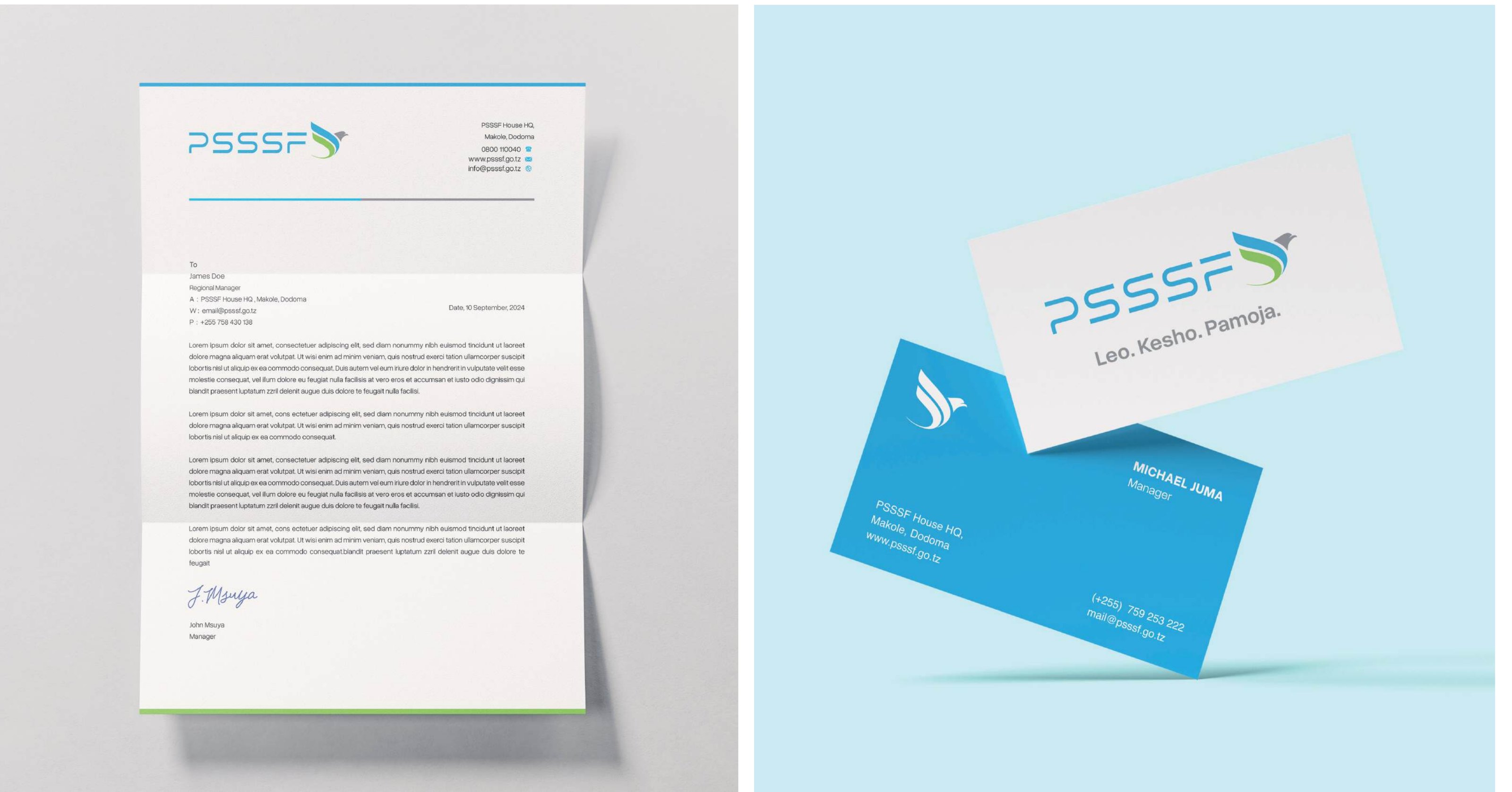
Stationery mockup
Manual p. 71 Download high-res

1.1 Stationery

Our stationeries integrates the brand’s color scheme and thoughtful logo placement to create an elegant and professional look. This design ensures that every piece of correspondence upholds the values of precision and aesthetic consistency that define our brand, promoting a unified brand image.

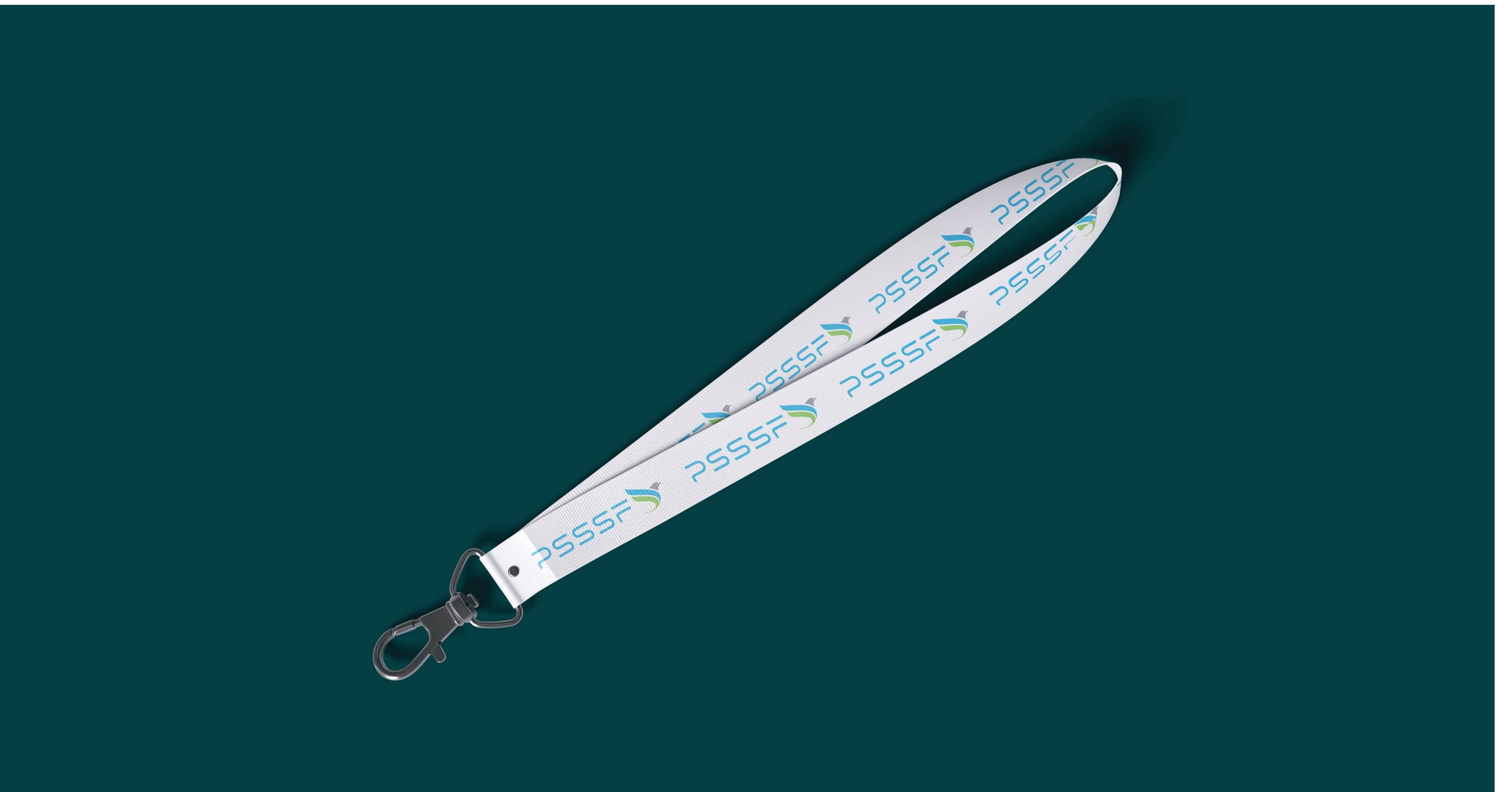
Lanyard mockup
Manual p. 72 Download high-res

1.2 Lanyard

Visual reference only — no written guidance in the manual.

Posters mockup
Manual p. 73 Download high-res

1.3 Posters

Designed to effectively communicate our core values and enhance brand awareness, our posters integrate our logo, distinctive typography, and our unique style elements. Each poster is a visual ambassador of our values, designed to capture attention and engage viewers in high-traffic areas.

Banners mockup
Manual p. 74 Download high-res

1.4 Banners

Our horizontal banners are crafted with eye-catching visuals and clear, engaging messages that make a big impact in larger spaces. Designed for readability from a distance, these banners effectively promote the brand and its values at events, in public spaces, or in commercial settings.

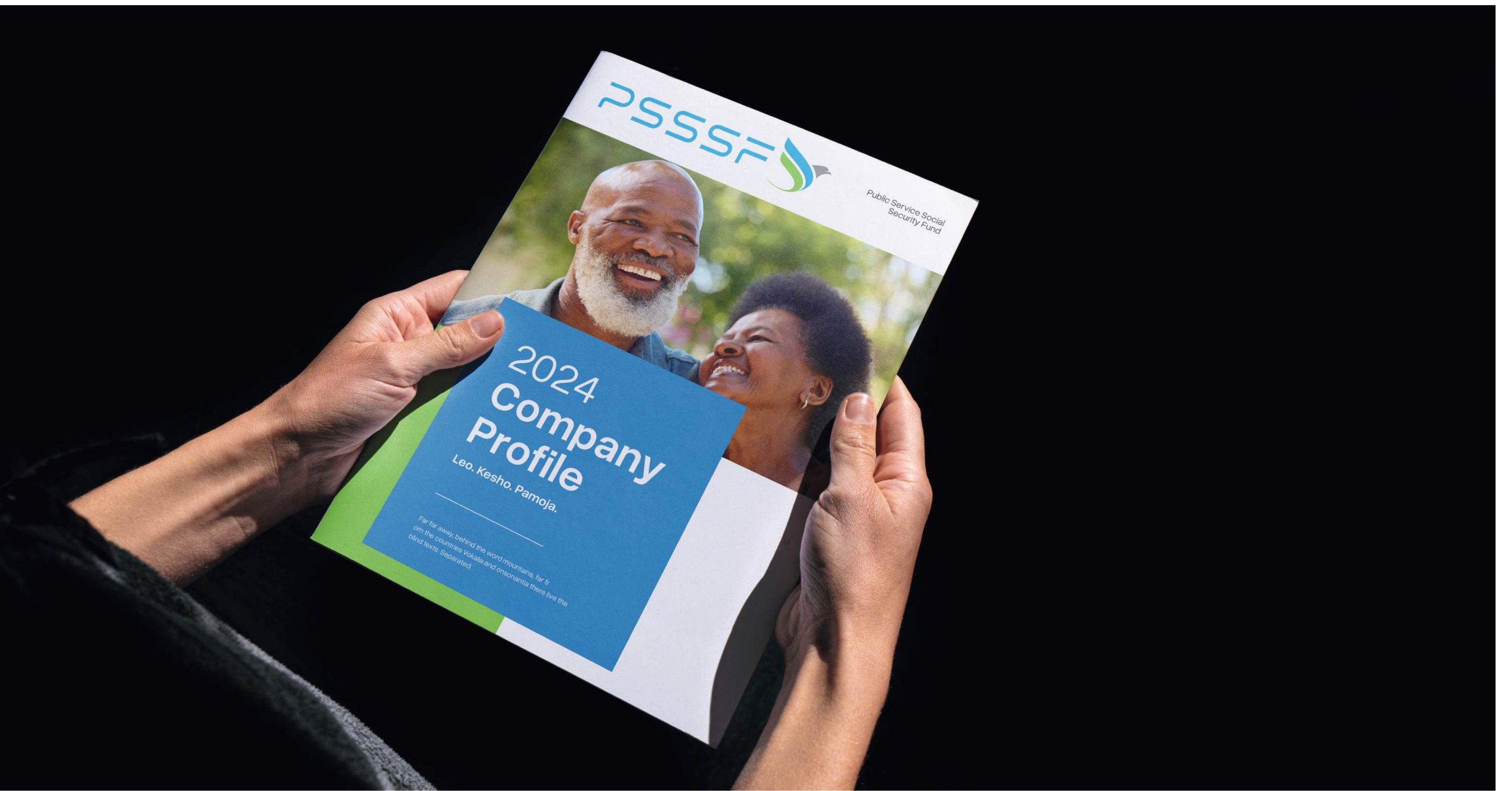
Brochure mockup
Manual p. 75 Download high-res

1.5 Brochure

Our brochures utilize a warm and inviting color scheme to convey professionalism and approachability. These colors are specifically chosen to make complex information more accessible and engaging, ideal for detailed client communications.

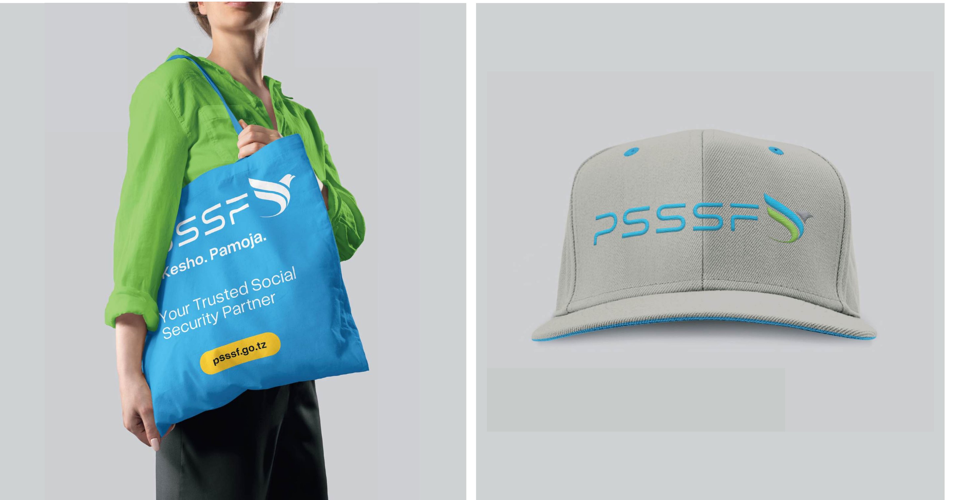
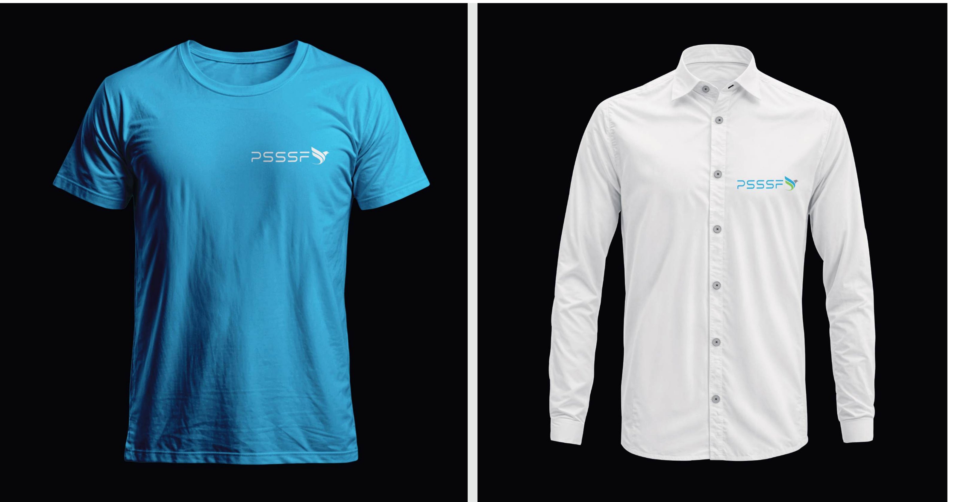
Apparel mockup
Manual p. 76 Download high-res

1.6 Apparel

Visual reference only — no written guidance in the manual.

Promotional Materials mockup
Manual p. 77 Download high-res

1.7 Promotional Materials

Visual reference only — no written guidance in the manual.

Tumbler mockup
Manual p. 78 Download high-res

1.8 Tumbler

Visual reference only — no written guidance in the manual.

2

Digital Media

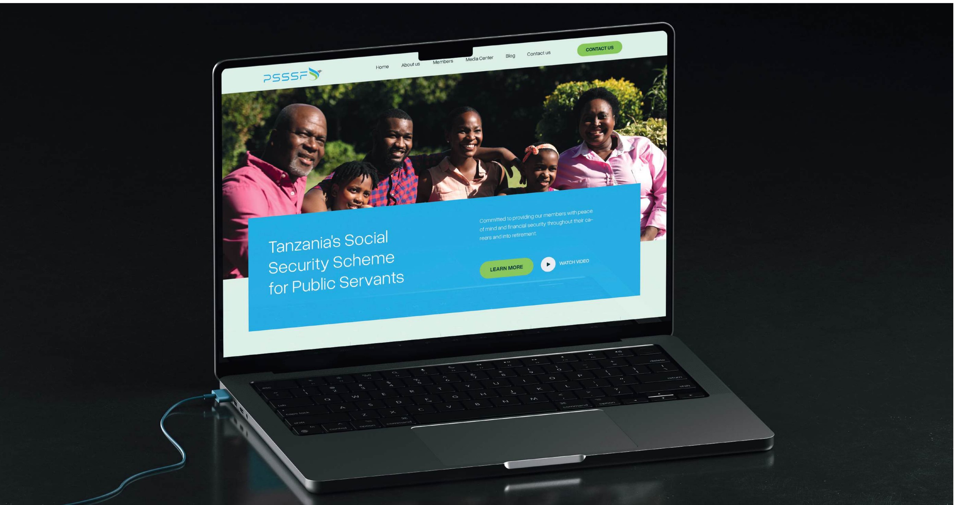
Website Design mockup
Manual p. 80 Download high-res

2.1 Website Design

Our website serves as the digital front door to PSSSF, designed to welcome visitors with a compelling hero header that instantly highlights our commitment to social security and member care. The homepage seamlessly transitions into an introduction of our organization, outlines our core services, provides information on member benefits, and emphasizes our dedication to financial security and support. Each section is thoughtfully crafted to both inform and engage visitors, concluding with a comprehensive footer that includes contact information, social media links, and additional resources

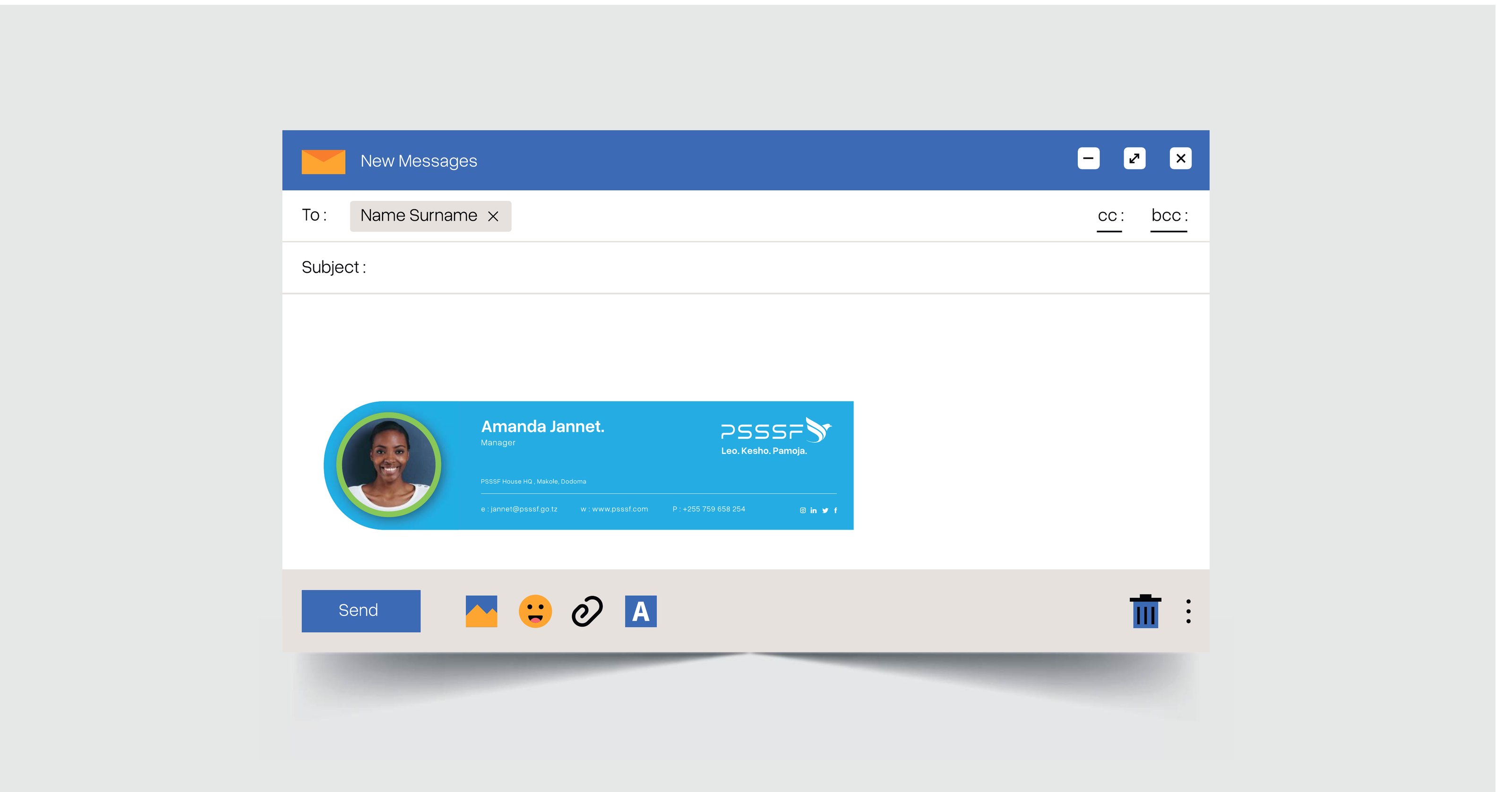
Email Signature mockup
Manual p. 81 Download high-res

2.2 Email Signature

Our standardized email signature is designed to project professionalism and maintain brand consistency. It includes essential contact details—name, position, and contact information—accompanied by our carefully positioned logo to enhance brand recognition. This signature template ensures that every email sent by our team members conveys a uniform and professional image, reinforcing our brand with each communication.

Newsletter Template mockup
Manual p. 82 Download high-res

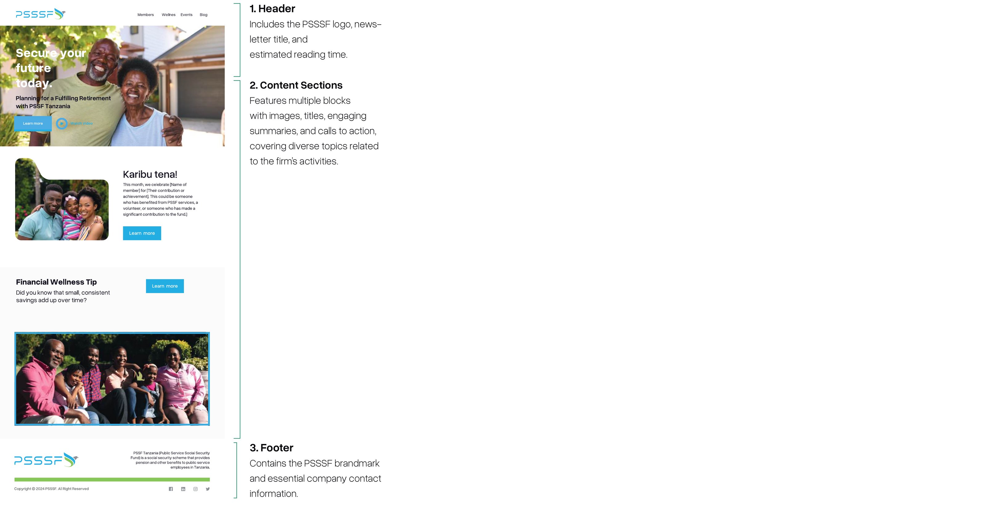
2.3 Newsletter Template

Our digital newsletter is crafted to captivate and inform our members and subscribers. Starting with an eye-catching header, the layout proceeds through organized blocks of content that may include updates, insights, and news, concluding with a comprehensive footer that provides additional links and contact information.

  1. Header — Includes the PSSSF logo, newsletter title, and estimated reading time.
  2. Content Sections — Features multiple blocks with images, titles, engaging summaries, and calls to action, covering diverse topics related to the Fund’s activities.
  3. Footer — Contains the PSSSF brandmark and essential company contact information.
Social Media mockup
Manual p. 83 Download high-res

2.4 Social Media

Our tailored social media templates are integral to our digital strategy, designed to ensure uniformity and engagement across platforms. Each template integrates our signature design elements—color palette, typography, and logos—into posts that are both informative and appealing. The examples include various post types, demonstrating how our templates adapt to everything from simple announcements to detailed service and member updates, ensuring high engagement and consistent branding.

Digital Banners mockup
Manual p. 84 Download high-res

2.5 Digital Banners

Our digital banners are designed to capture attention quickly, whether displayed on websites or used in online advertising. Both horizontal and vertical formats are thoughtfully created, featuring strong visual elements and clear messaging that align with our brand’s themes of security and trust. The vertical banners, in particular, are laid out with a stacked design to ensure they are impactful and visually coherent in digital environments where space may be constrained.

Horizontal Banner Size: 16:9 · Vertical Banner Size: 9:16

3

Packaging

Coffee Cups mockup
Manual p. 86 Download high-res

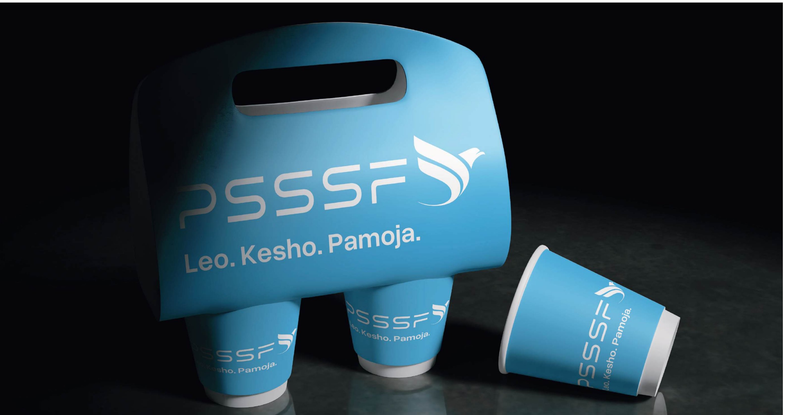
3.1 Coffee Cups

Our branded coffee cups are designed to seamlessly blend functionality with the Fund’s visual identity. Featuring the PSSSF logo and our tagline ‘Leo. Kesho. Pamoja.,’ these cups enhance our brand presence daily. The design reinforces our identity as a trusted social security institution, making even a coffee break an opportunity to reflect our commitment to members’ wellbeing.

Stickers mockup
Manual p. 87 Download high-res

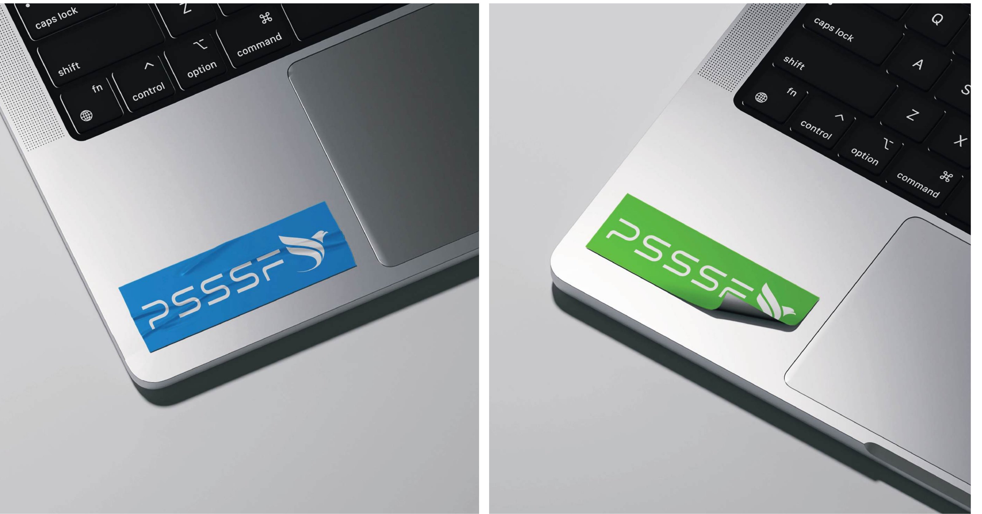
3.2 Stickers

PSSSF utilizes high-quality foil stickers to extend our brand’s reach. These stickers are designed to be both durable and visually appealing, featuring our logo in striking detail. Ideal for official documentation, laptops, and other office equipment, they serve as a subtle yet effective branding tool that maintains visibility in various settings.

Napkins mockup
Manual p. 88 Download high-res

3.3 Napkins

Our branded napkins are used alongside our coffee cups in the office and during company events, ensuring a consistent brand experience. These napkins feature the PSSSF logo, subtly reinforcing our identity in a practical and elegant manner. They are designed to complement our coffee cups, creating a cohesive and branded environment that enhances the professional and creative atmosphere of our spaces.

4

Signage

Projecting Sign mockup
Manual p. 90 Download high-res

4.1 Projecting Sign

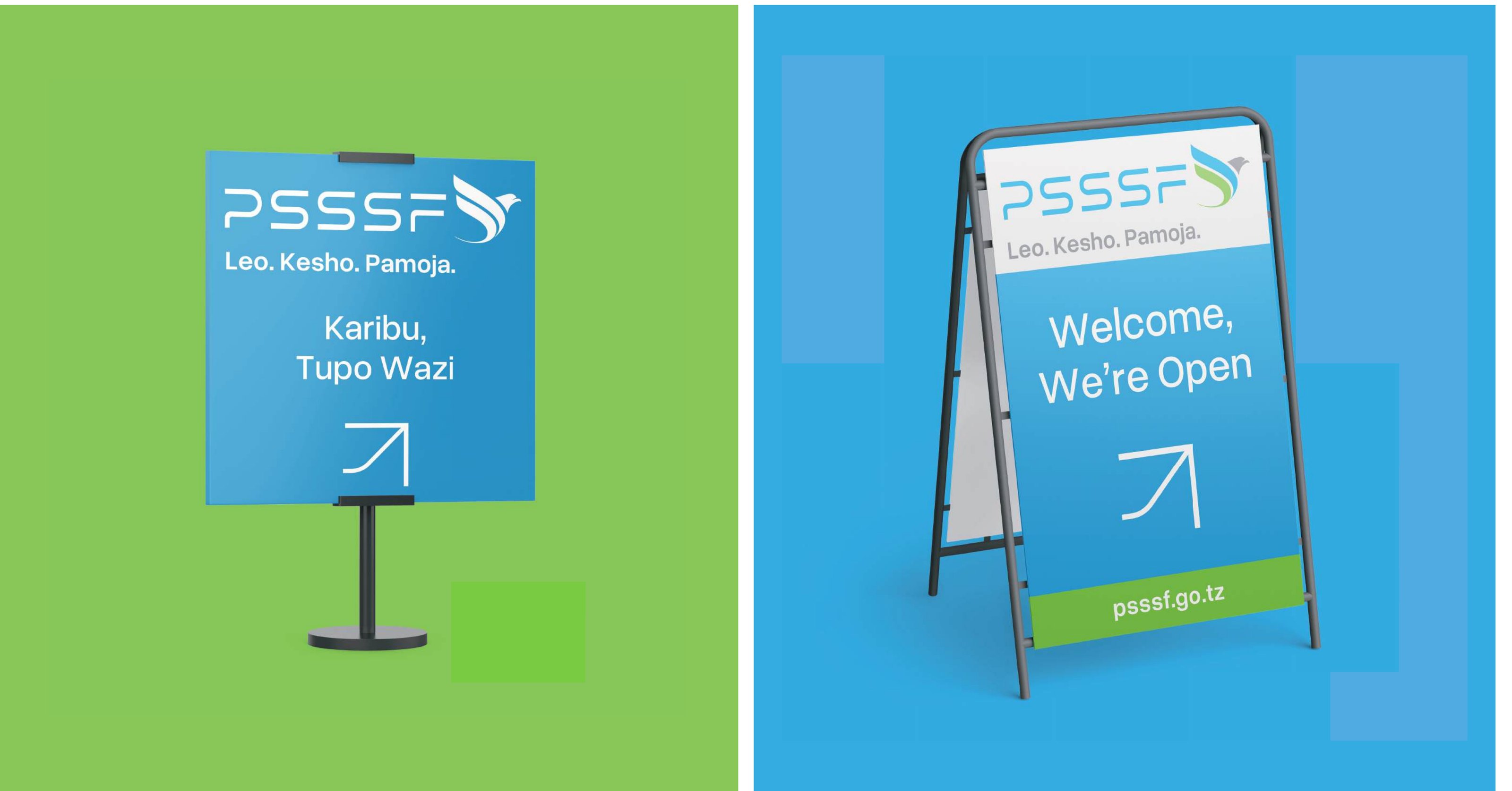
Our projecting sign prominently features the PSSSF logo, designed to stand out and be visible from a distance. Mounted on the building facade, this sign acts as a beacon for our office, guiding clients and visitors alike with its distinctive and professional appearance that reflects our brand’s values of trust and service.

A-Board mockup
Manual p. 91 Download high-res

4.2 A-Board

Situated at the front of our office, the A-Board is an inviting gesture to visitors, featuring our logo along with the welcoming message ‘Welcome, we’re open,’ complete with an arrow directing towards the entrance. This sign is designed to catch the eye and clearly indicate accessibility, enhancing visitor experience and office accessibility.

Wayfinding mockup
Manual p. 92 Download high-res

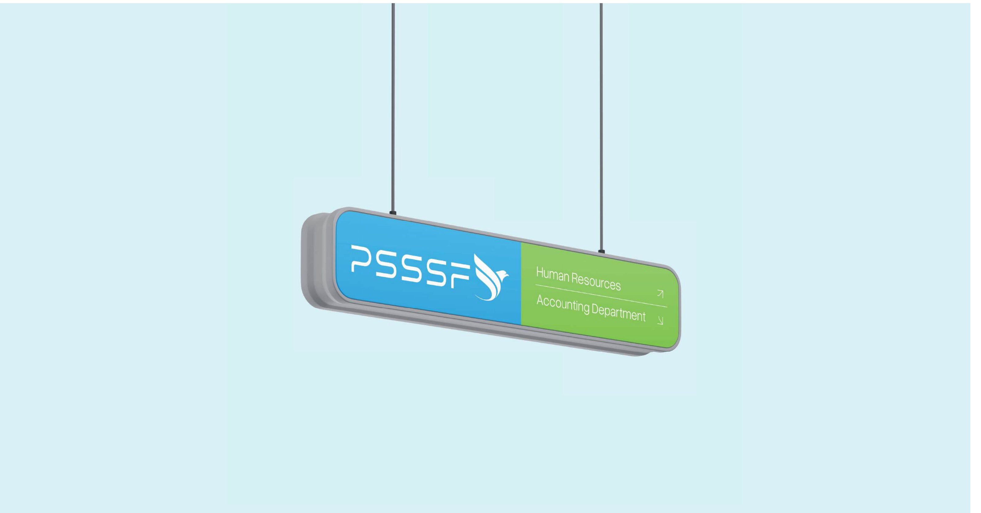
4.3 Wayfinding

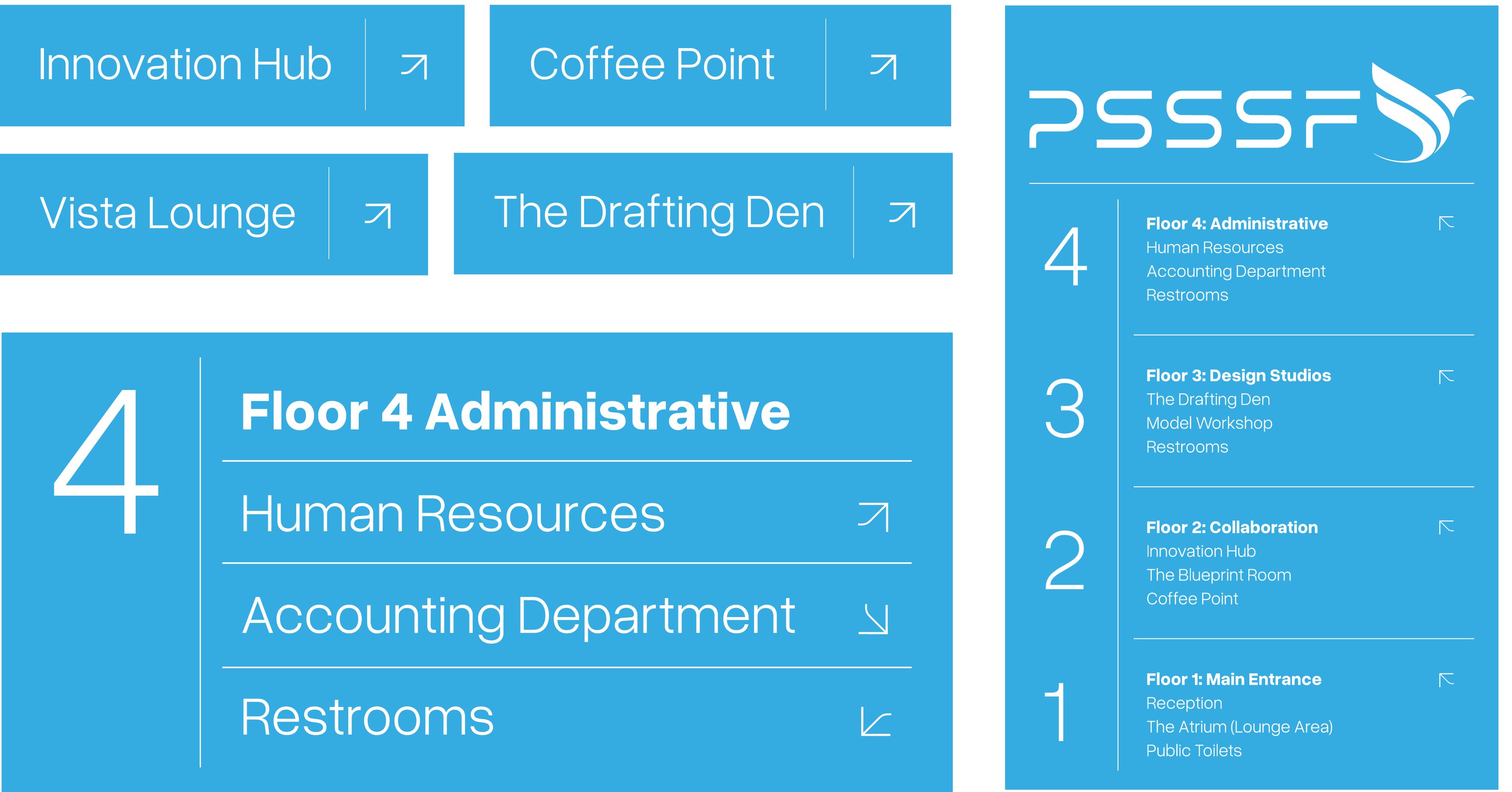
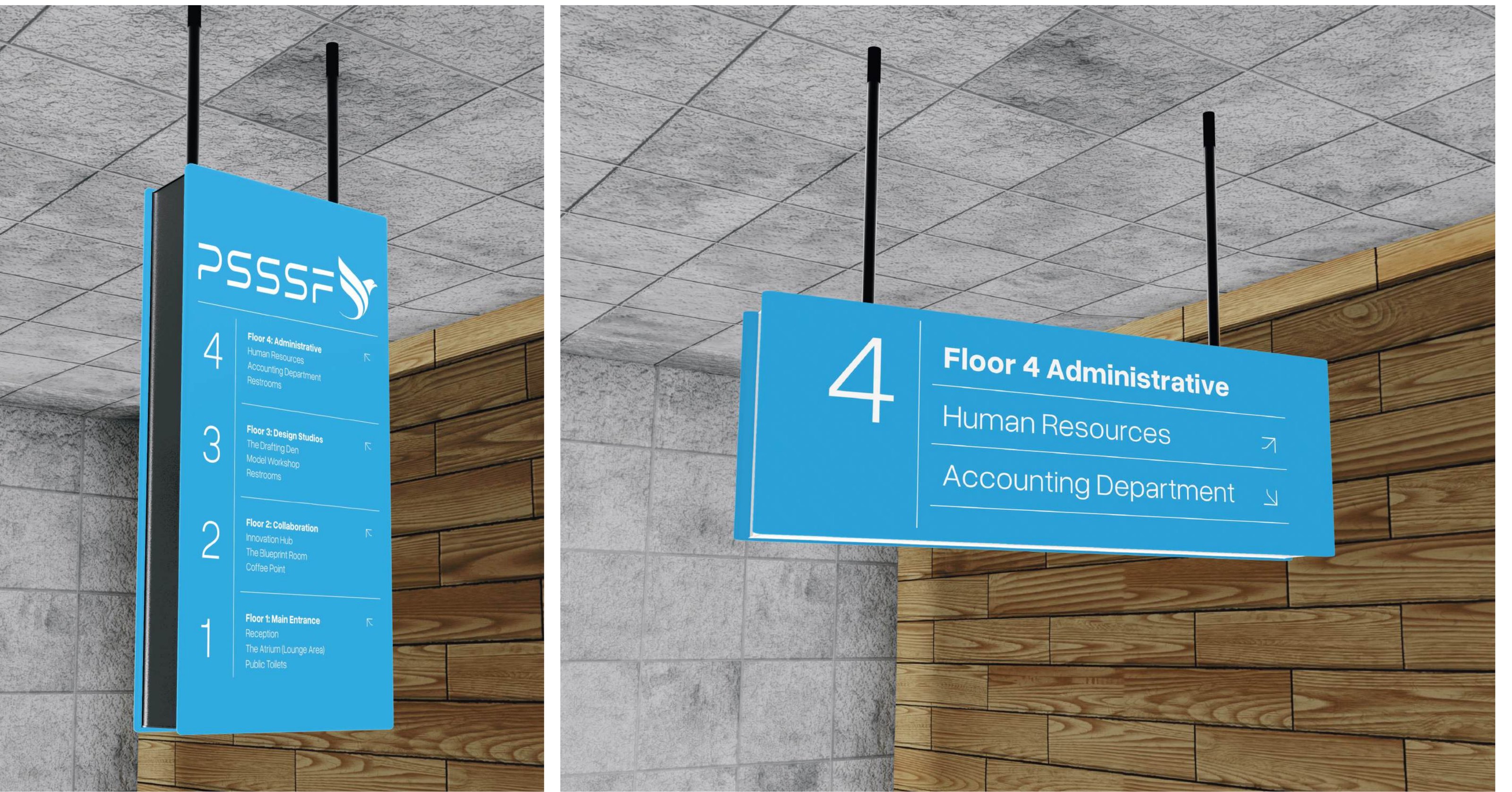
Our wayfinding system within the office includes a series of well-designed signs that enhance navigation through our space. The system comprises horizontal signs for general directions, vertical squared signs at each floor entrance, and horizontal squared signs positioned next to the elevators, each clearly marking zones and directions to facilitate smooth movement for all occupants and visitors.

Wayfinding — mockup mockup
Manual p. 93 Download high-res

4.3 Wayfinding — mockup

This mockup displays our horizontal wayfinding signs, designed for clarity and ease of reading. They feature concise directions and are strategically placed to guide visitors and staff through common areas and towards major destinations within the building, such as conference rooms and offices.

5

Facility Design

Member Service Center mockup
Manual p. 95 Download high-res

5.1 Member Service Center

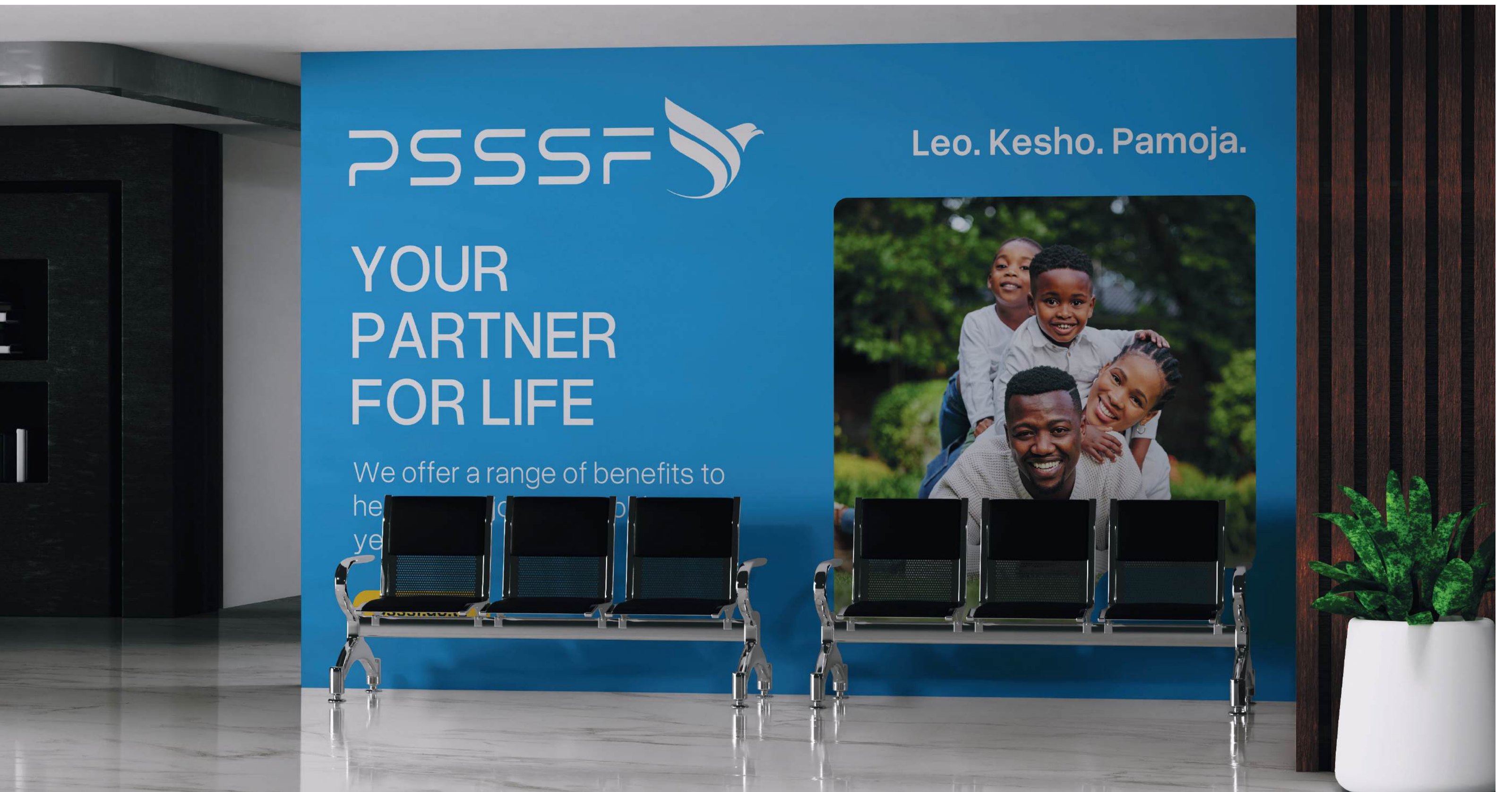
The PSSSF Member Service Center features a prominent display wall showcasing our logo, slogan, and website URL, encouraging engagement and interaction. It combines our style element and an image representing our commitment to social security services, creating a dynamic visual representation of our mission and values.

Stage Banner mockup
Manual p. 96 Download high-res

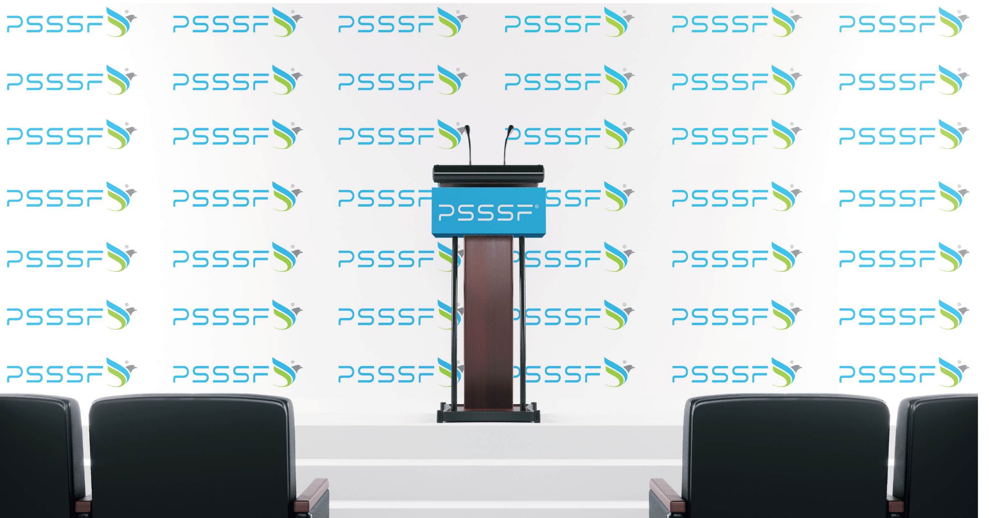
5.2 Stage Banner

The PSSSF stage banner design has an elegant and professional layout. The PSSSF logo is prominently displayed on the banner, and it is repeated throughout the background in a subtle and tasteful manner. The vibrant visuals create an inspiring space that reinforces our brand identity and values for both staff and visitors.

Flag mockup
Manual p. 97 Download high-res

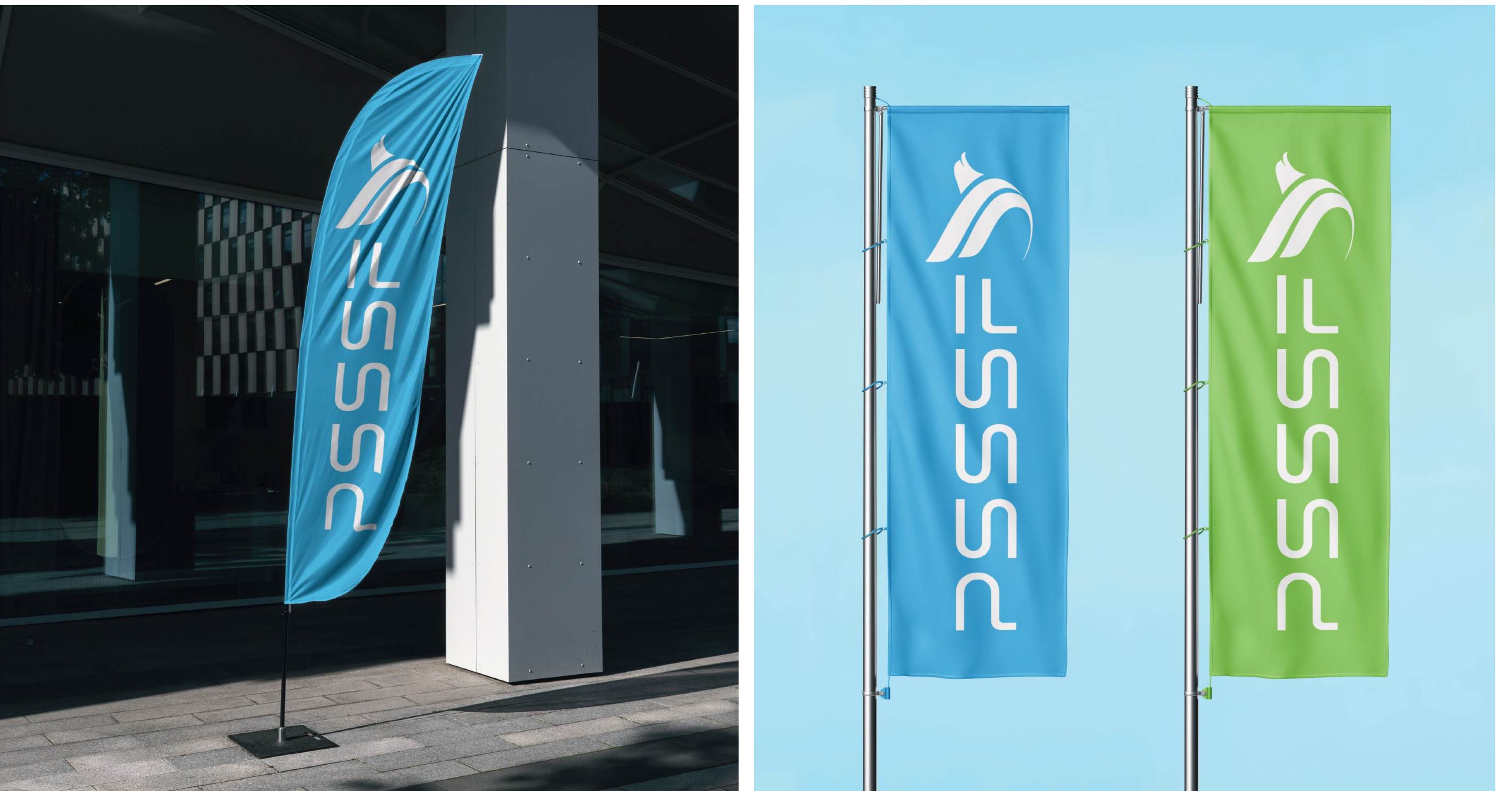
5.3 Flag

Our flags are designed with a vibrant blue or green background, featuring the PSSSF logo and text in white. These flags are used both at our offices and events to enhance visibility and brand recognition, proudly waving as symbols of PSSSF’s commitment and unity.

Billboard mockup
Manual p. 98 Download high-res

5.4 Billboard

At key locations, our branded billboards display important information clearly. These billboards are not only functional, providing essential details about PSSSF’s services, but also serve as marketing tools, showcasing our brand’s commitment and reinforcing our presence within the community—Leo, Kesho, Pamoja.

Meeting Room mockup
Manual p. 99 Download high-res

5.5 Meeting Room

Visual reference only — no written guidance in the manual.

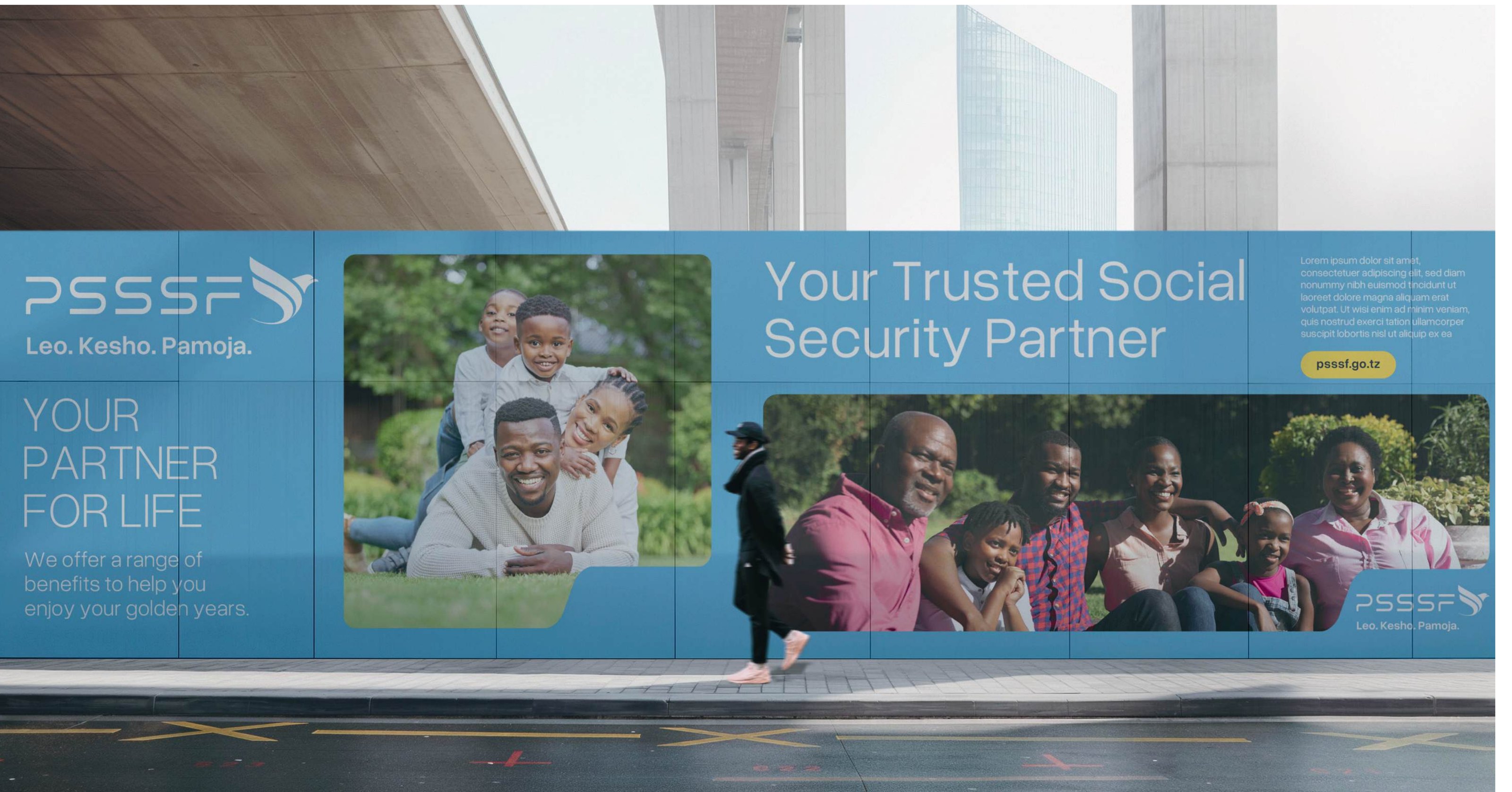
Hoarding mockup
Manual p. 100 Download high-res

5.6 Hoarding

Our hoardings, designed in PSSSF’s signature blue and green colors, are strategically placed around key locations such as office sites and event venues. Featuring branded imagery, style elements, and clear typography, these hoardings enclose spaces, enhance visual appeal, and inform the public about PSSSF’s initiatives, reflecting our commitment to clear communication and brand presence.

6

Presentation and Reports

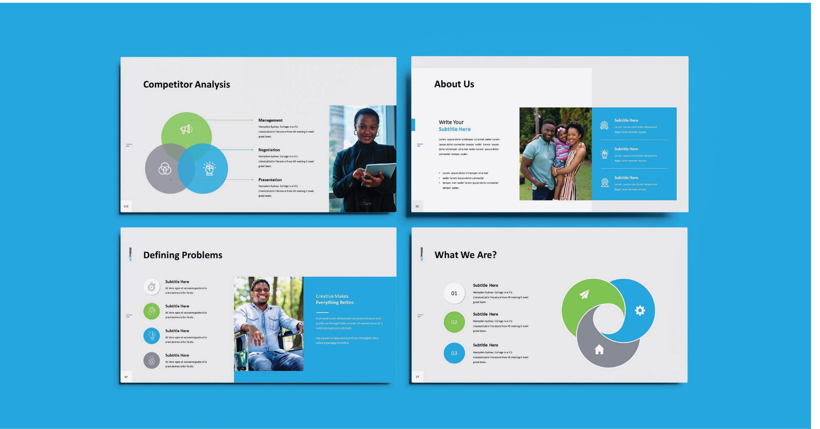
Presentation mockup
Manual p. 102 Download high-res

6.1 Presentation

Our presentation decks are designed with meticulous attention to layout and design, ensuring every slide reflects our brand’s ethos of clarity and innovation. The guidelines showcase various page layouts that balance text, imagery, and our brand elements to communicate effectively and engage the audience.

Annual Reports mockup
Manual p. 103 Download high-res

6.2 Annual Reports

This spread mockup from an annual report demonstrates the effective use of our color scheme and layout principles. It shows how data and text are integrated within the aesthetic framework of our branding, ensuring that the spreads are not only informative but also visually engaging.

7

Events

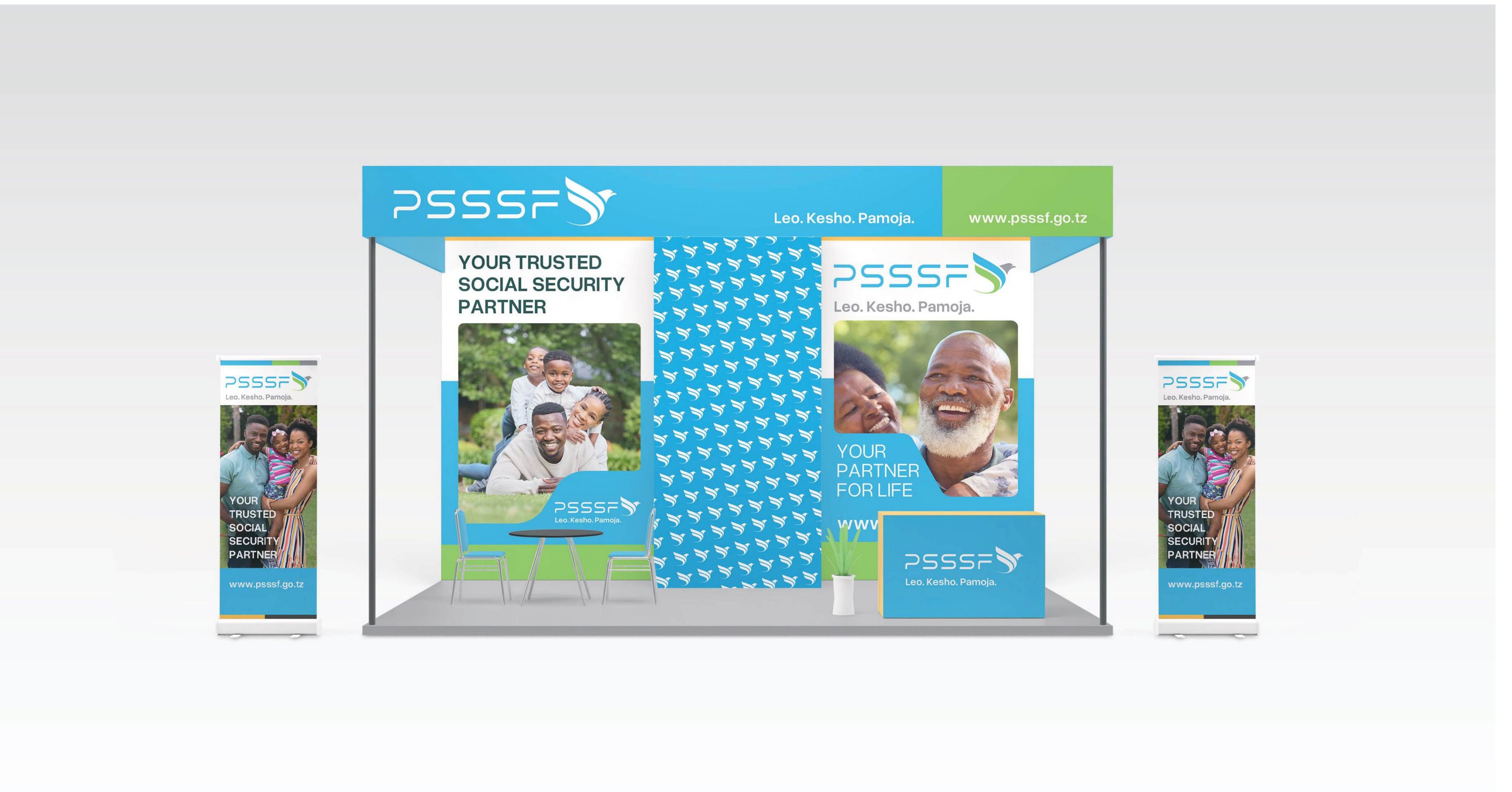
Stand Design mockup
Manual p. 105 Download high-res

7.1 Stand Design

Our event stand designs are meticulously crafted to embody the integrity and member-focused spirit of PSSSF. This page highlights a stand that has been used at industry events, showcasing a blend of dynamic spatial arrangement and compelling visual elements. Featuring our brand colors, logos, and strategic lighting, the design invites interaction and provides an immersive brand experience. Functional yet aesthetically pleasing, our stands are engineered to facilitate conversations, display our services, and enhance attendee engagement.

We use exhibition space not less than 3*6 (18 sqm) and above for proper arrangement and visibility.

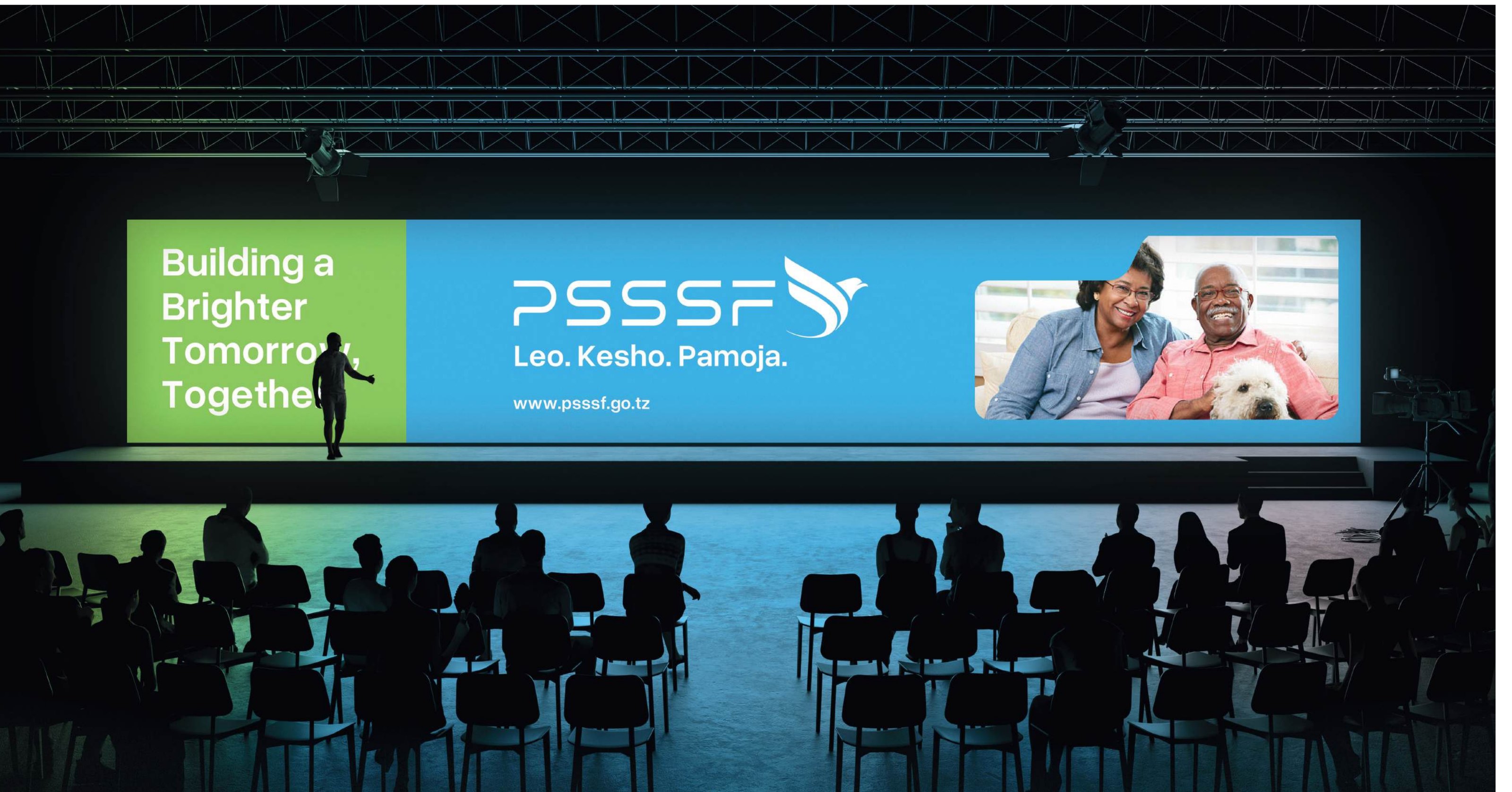
Conference Presentation mockup
Manual p. 106 Download high-res

7.2 Conference Presentation

The conference presentation design guidelines focus on creating a visually striking and cohesive backdrop for our speakers. The example shown includes a wide screen presentation format that effectively utilizes PSSSF’s branding elements. It incorporates a balanced use of our corporate colors, intelligently placed logos, and text formatting that ensures legibility from a distance. This setup is designed to not only capture but also retain the audience’s attention during presentations, reinforcing our brand’s presence and authority at large-scale industry events.

8

App Design

Application Design mockup
Manual p. 108 Download high-res

8.1 Application Design

Our application design guidelines are tailored to enhance user experience while reinforcing our brand identity across digital platforms. The first page, a loading screen, features a simple yet elegant design with our logo prominently displayed against a vibrant green background, immediately establishing a connection with our brand. The second page, an interface design, is meticulously laid out with a user-friendly header, informative body text, and an engaging illustration that visually complements the content. A prominently placed call-to-action (CTA) encourages user interaction, guiding them to the next steps seamlessly.

9

Vehicle Design

Van mockup
Manual p. 110 Download high-res

9.1 Van

The design for our vehicles features our vibrant blue, green and grey, complemented by the Fund’s logo, slogan, and website. This bold branding ensures that our presence onsite is both professional and immediately recognizable, effectively extending our brand visibility in every location we operate.

Hatch Back mockup
Manual p. 111 Download high-res

9.2 Hatch Back

Visual reference only — no written guidance in the manual.

Minibus mockup
Manual p. 112 Download high-res

9.3 Minibus

Visual reference only — no written guidance in the manual.

Documentation 1.1–1.4 (pp. 113–120)

11 Documentation

1.1

File Names and Naming Conventions

This page establishes standardized file naming protocols to enhance digital asset management across PSSSF. By detailing clear, systematic naming structures for documents, images, and media, we ensure easy accessibility and organizational consistency. These guidelines cover prefixes, date formats, version control, and descriptors, streamlining file retrieval and supporting efficient collaboration both internally and with external partners.

File nameUse
PSSSF_Logo_Light_Horizontal_RGB.epsFor use on light backgrounds in RGB color mode.
PSSSF_Logo_Light_Horizontal_CMYK.epsFor use on light backgrounds in CMYK color mode for print.
PSSSF_Logo_Dark_Horizontal_RGB.epsFor use on dark backgrounds in RGB color mode.
PSSSF_Logo_Dark_Horizontal_CMYK.epsFor use on dark backgrounds in CMYK color mode for print.
PSSSF_Brandmark_Light_RGB_Small.pngSmall version for use on light backgrounds in RGB color mode.
PSSSF_Brandmark_Light_RGB_Normal.pngNormal version for use on light backgrounds in RGB color mode.
PSSSF_Brandmark_Dark_RGB_Small.pngSmall version for use on dark backgrounds in RGB color mode.
PSSSF_Brandmark_Dark_RGB_Normal.pngNormal version for use on dark backgrounds in RGB color mode.
PSSSF_Brandmark_Light_CMYK_Small.pngSmall version for use on light backgrounds in CMYK color mode for print.
PSSSF_Brandmark_Light_CMYK_Normal.pngNormal version for use on light backgrounds in CMYK color mode for print.
PSSSF_Brandmark_Dark_CMYK_Small.pngSmall version for use on dark backgrounds in CMYK color mode for print.
PSSSF_Brandmark_Dark_CMYK_Normal.pngNormal version for use on dark backgrounds in CMYK color mode for print.
PSSSF_Pattern_Tile.epsA tileable pattern file for use in various branding materials.

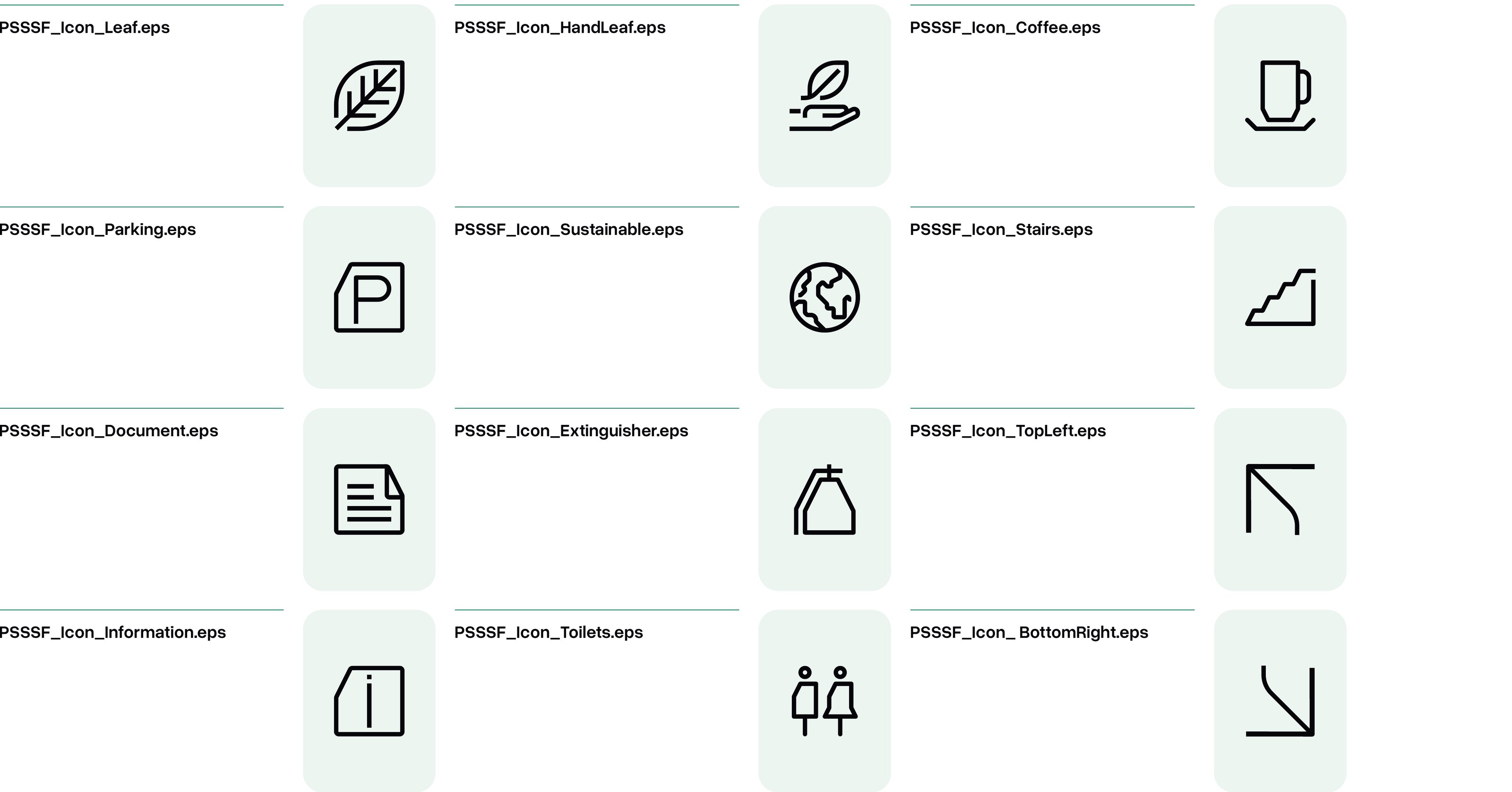
Icon files

  • PSSSF_Icon_Leaf.eps
  • PSSSF_Icon_HoldingLeaf.eps
  • PSSSF_Icon_SustainableWorld.eps
  • PSSSF_Icon_Coffee.eps
  • PSSSF_Icon_Parking.eps
  • PSSSF_Icon_Information.eps
  • PSSSF_Icon_People.eps
  • PSSSF_Icon_Stairs.eps
  • PSSSF_Icon_Document.eps
  • PSSSF_Icon_Signage.eps
  • PSSSF_Icon_DirectionUp.eps
  • PSSSF_Icon_DirectionDown.eps
Icon file names with icon previews
Manual p. 117 Download high-res

1.2

Downloadable Assets

Welcome to the central resource for all PSSSF branded materials. This repository is designed to provide you with quick access to essential branding elements that align with our visual identity standards. Below, you will find categorized assets ready for download and use, subject to the terms outlined in our brand guidelines

Brand guidelines, logos and fonts

PSSSF Brand Guidelines

PDF · 7.9 MB — Complete manual, 2026, Version 1.4

Download

PSSSF Logo Pack

ZIP (SVG + PNG, 12 files each) · 1.0 MB — Every logo version in full colour, white and Firefly

Download

Typography Pack — Overused Grotesk

ZIP (OTF + TTF, 8 weights + variable) · 314 KB — Primary typeface font files

Download

Individual logo files

Horizontal logo — Full colour

Horizontal logo — Full colour

For White and light backgrounds

Horizontal logo — White

Horizontal logo — White

For Butterfly Blue, Pea Green, Star Dust and Firefly backgrounds

Horizontal logo — Firefly

Horizontal logo — Firefly

For Lightning Yellow and light backgrounds

Vertical logo — Full colour

Vertical logo — Full colour

For White and light backgrounds

Vertical logo — White

Vertical logo — White

For Butterfly Blue, Pea Green, Star Dust and Firefly backgrounds

Vertical logo — Firefly

Vertical logo — Firefly

For Lightning Yellow and light backgrounds

Logotype — Full colour

Logotype — Full colour

For White and light backgrounds

Logotype — White

Logotype — White

For Butterfly Blue, Pea Green, Star Dust and Firefly backgrounds

Logotype — Firefly

Logotype — Firefly

For Lightning Yellow and light backgrounds

Brandmark / monogram — Full colour

Brandmark / monogram — Full colour

For White and light backgrounds

Brandmark / monogram — White

Brandmark / monogram — White

For Butterfly Blue, Pea Green, Star Dust and Firefly backgrounds

Brandmark / monogram — Firefly

Brandmark / monogram — Firefly

For Lightning Yellow and light backgrounds

Photography and personas

Image usage photography set

JPG · 324 KB — Reference imagery

Download

Persona portrait — Aisha Mohamed

JPG · 161 KB — Reference imagery

Download

Persona portrait — Fatuma Hassan

JPG · 142 KB — Reference imagery

Download

Persona portrait — John Msuya

JPG · 119 KB — Reference imagery

Download

Persona portrait — John Mwenda

JPG · 100 KB — Reference imagery

Download

Every figure on this site can also be downloaded in high resolution with the “Download high-res” link below it.

The typography pack contains Overused Grotesk only; Roboto is available free from Google Fonts.

1.3

Terms and Conditions

PSSSF Brand Guidelines: Terms and Conditions

1. Introduction
These terms and conditions govern the usage of PSSSF’s brand assets, including but not limited to logos, typography, color palettes, and all associated graphical materials. Compliance with these guidelines is mandatory for all employees, partners, and third-party entities to ensure brand consistency across all platforms and mediums.
2. Intellectual Property
All branding materials, including logos, designs, and textual content, are the intellectual property of PSSSF. Unauthorized use, reproduction, or alteration without prior written approval is strictly prohibited.
3. Usage Rights
Permission to use brand assets is granted on a case-by-case basis and may be revoked at any time should the usage deviate from the approved purposes as outlined in these guidelines.
4. Modification of Brand Assets
Modifying, distorting, or altering the brand assets in any way not explicitly authorized within these guidelines is not permitted. All intended uses must maintain the integrity of the design elements without alteration.
5. Compliance Monitoring
PSSSF reserves the right to monitor the use of its brand assets to ensure compliance with these terms and conditions. Failure to comply may result in the withdrawal of the usage rights and potential legal action for brand damage.
6. Contact and Approval
For any uses not explicitly covered by these guidelines, or for questions regarding the application of these terms and conditions, please contact the PSSSF Marketing team at info@psssf.go.tz or pr@psssf.go.tz, or call (0)800 110040.
7. Amendments
These terms and conditions may be amended by PSSSF at any time. The continued use of the brand assets following any amendments indicates acceptance of the new terms.
8. Governing Law
These terms and conditions are governed by the laws of the jurisdiction in which PSSSF is headquartered, without regard to its conflict of law provisions.

1.4

Contact Information and Support

Questions, concerns, thoughts or need more information?

Contact our Marketing team.

Via phone
(0)800 110040

Listed in the table of contents (pp. 143–145) — pages not present in the supplied PDF

12 Appendices

1.1

Glossary of Terms

Key terms used throughout the PSSSF Brand Guidelines.

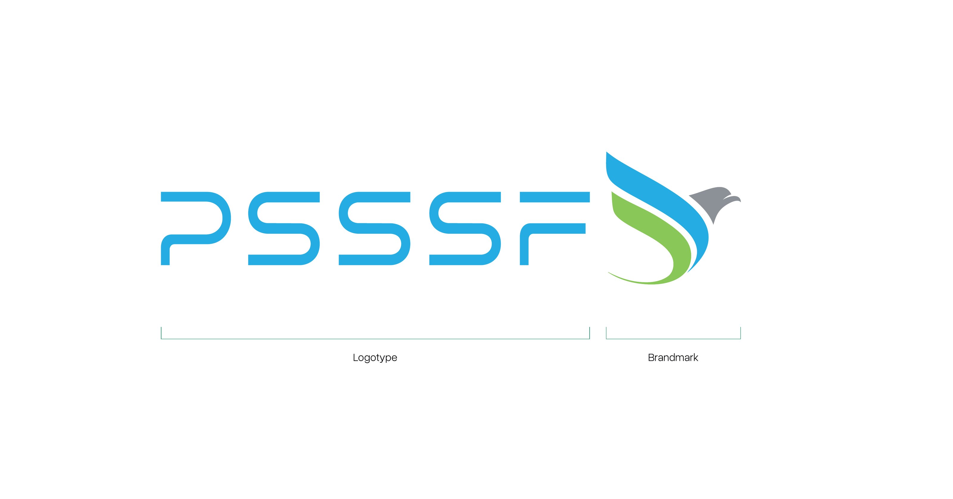
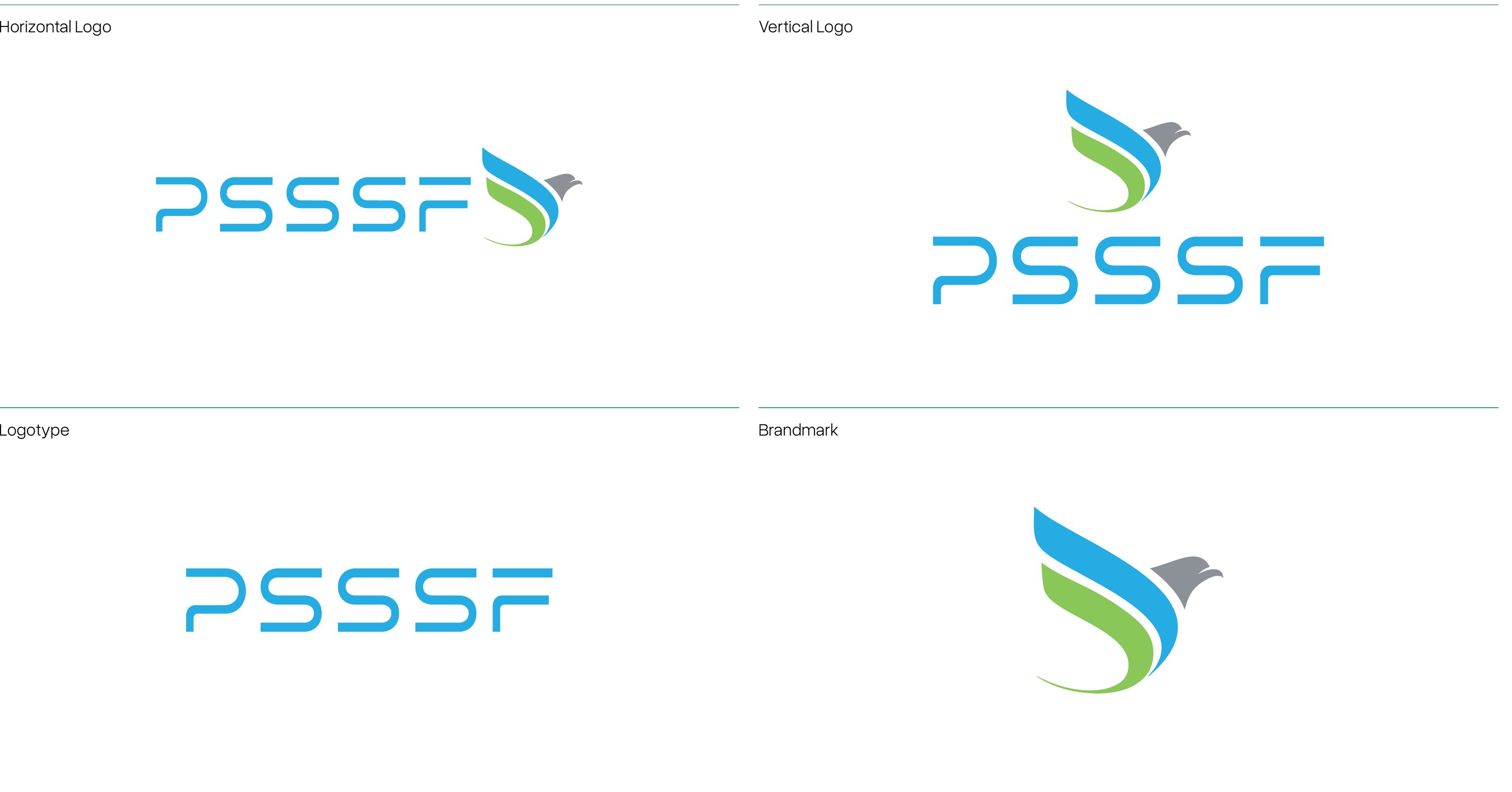
Logotype
The PSSSF letters within the logo. Logo Composition
Brandmark
The eagle with wings. Logo Explanation
Monogram
The eagle used on its own where simplicity and instant recognition are essential. Monogram
Clearspace
The protected area around the logo or monogram. Clearspace
Style Element
Rectangles or squares with a minus front cut at a 25-degree angle. Style Element
Tagline
“Leo. Kesho. Pamoja.” — Today. Tomorrow. Together. Brand Language
Tint
A lighter value of a brand colour used for backgrounds and supporting elements. Tints
Grid
The system of margins, columns and gutters that structures every layout. Margins and Columns
CMYK · RGB · HEX
Color models for print, screen and digital code. Color Values

1.2

FAQs

Who can use the PSSSF brand assets?
PSSSF staff, and partners or suppliers with written approval from the Marketing team, for official PSSSF communications only.
Which logo file should I use?
Use SVG for websites and digital design, PNG for office documents and presentations. Choose the full-colour logo on white, and the white logo on brand-colour backgrounds. Logo Usage
What if Overused Grotesk is not available?
Use Roboto, our replacement typeface, which is free on Google Fonts. Replacement Typeface
Can I change the logo colours?
No. Use only the approved colour versions shown in the guidelines. Logo Misuse
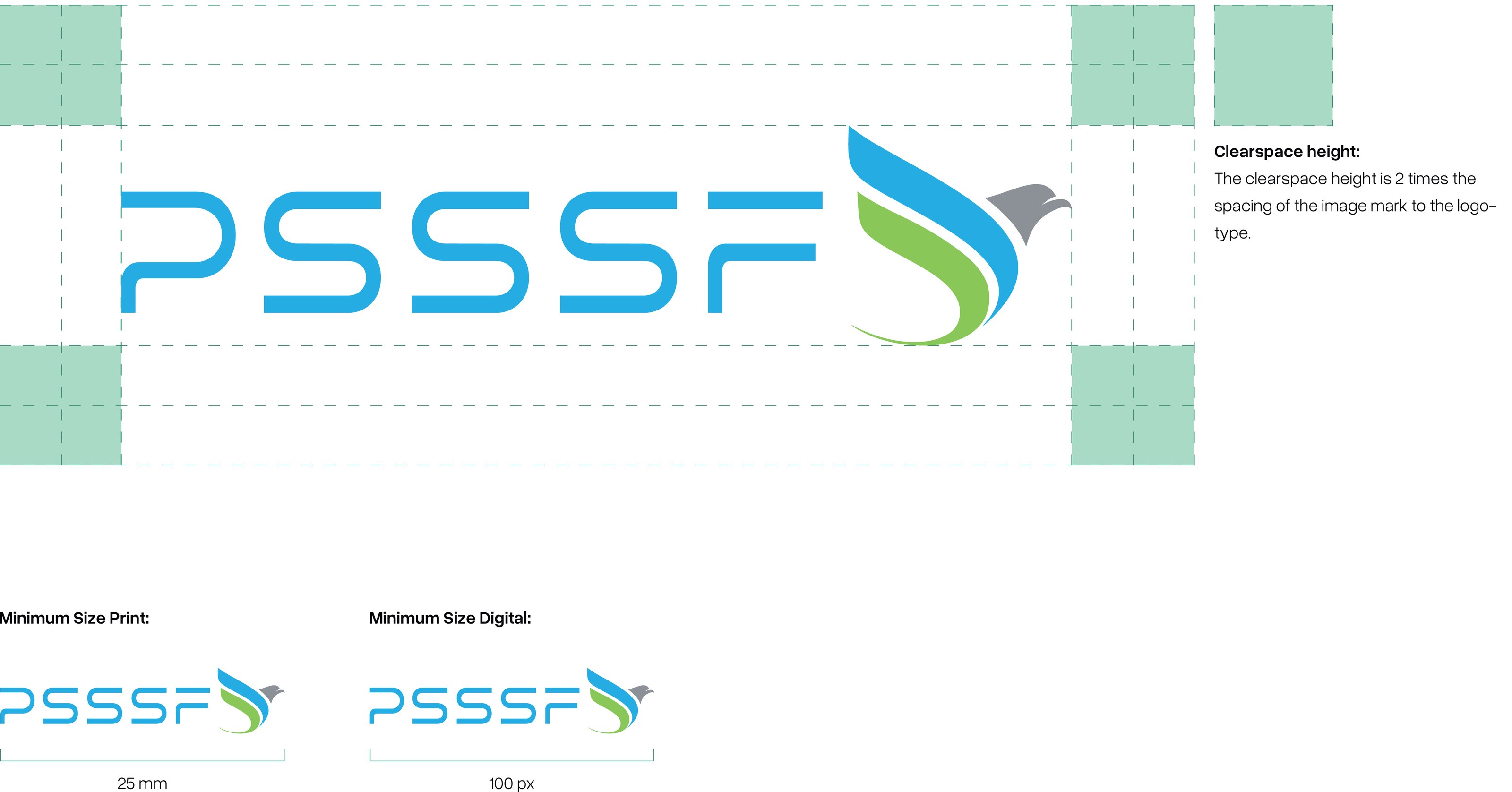
What is the smallest size for the logo?
100 px for digital and 25 mm for print. Clearspace & Minimum Size
Who approves new branded materials?
Send drafts to the Marketing team at info@psssf.go.tz or pr@psssf.go.tz before production. Contact

1.3

Additional Resources

Further resources to help you apply the PSSSF brand correctly.